New Energy Transport
Brand Identity
Branding Guide
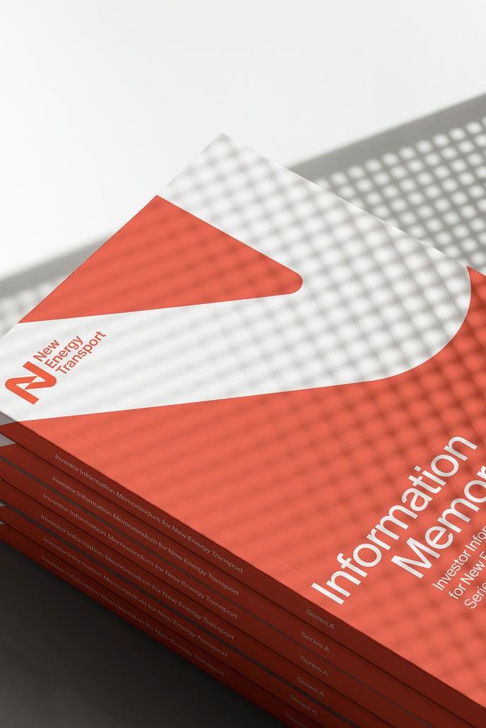
Printed Collateral
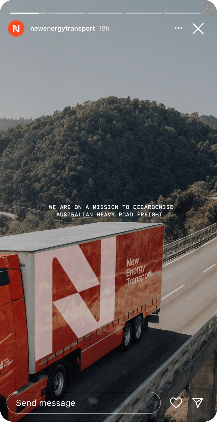
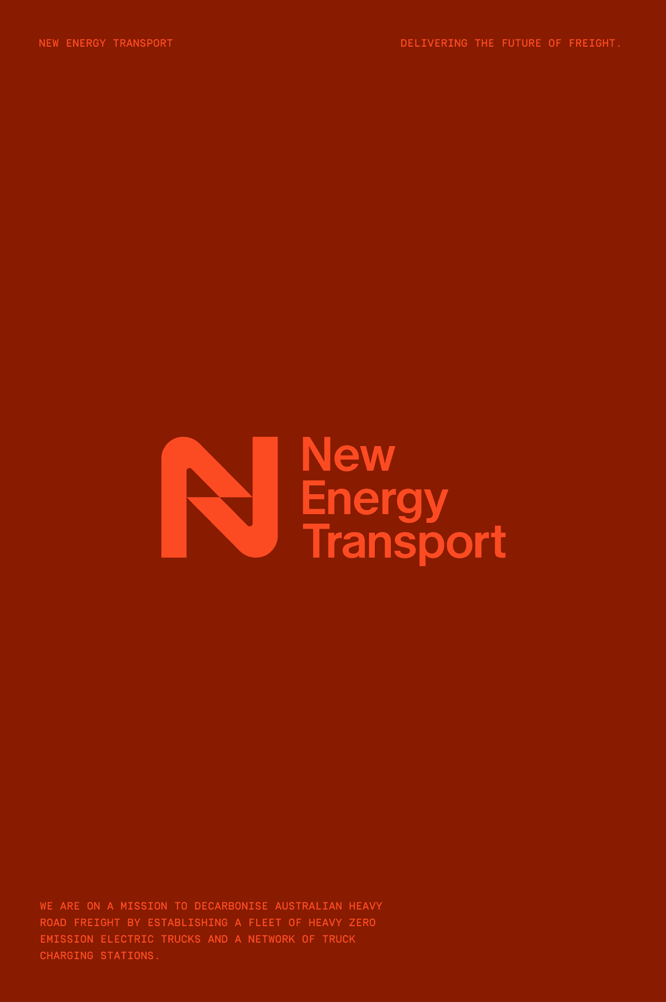
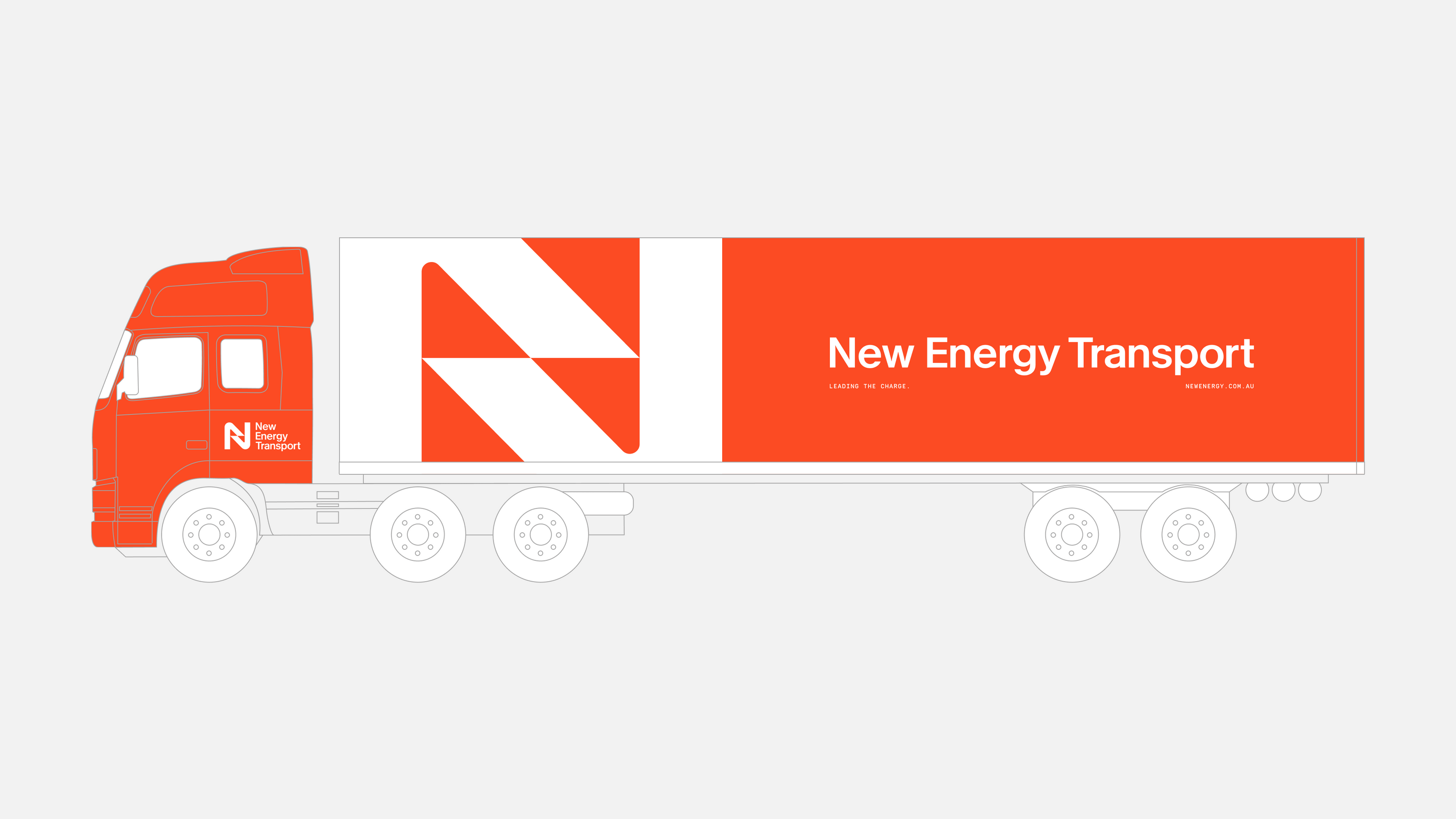
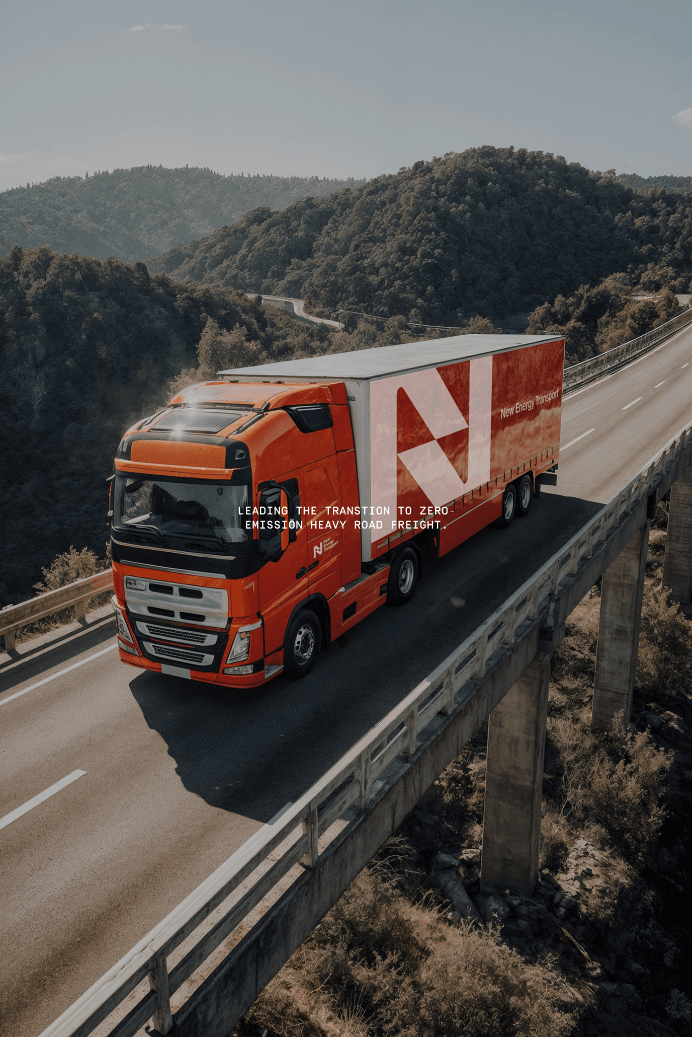
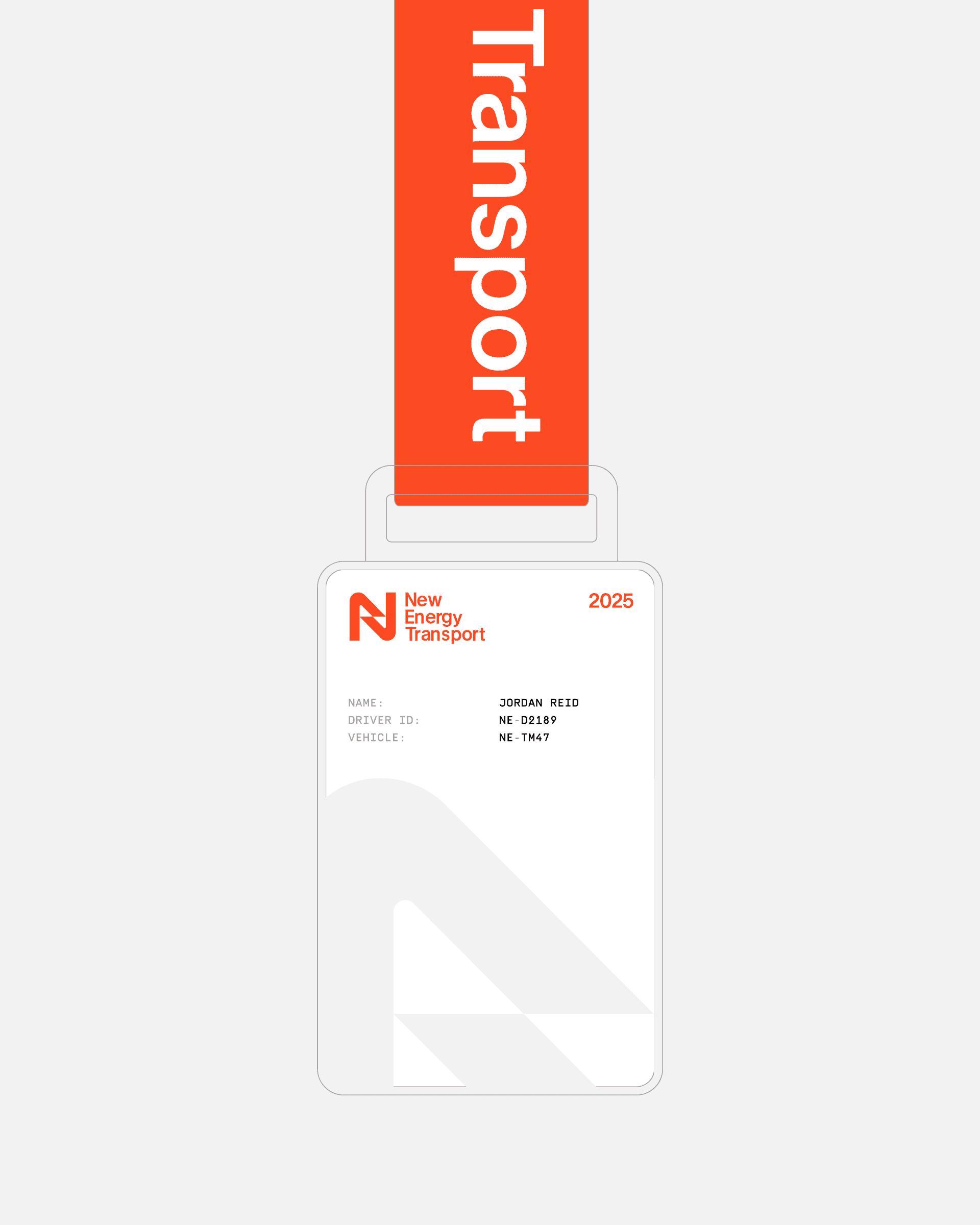
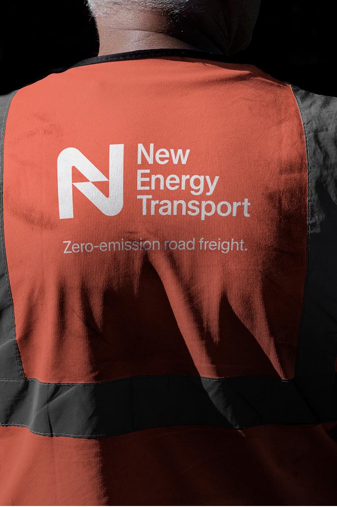
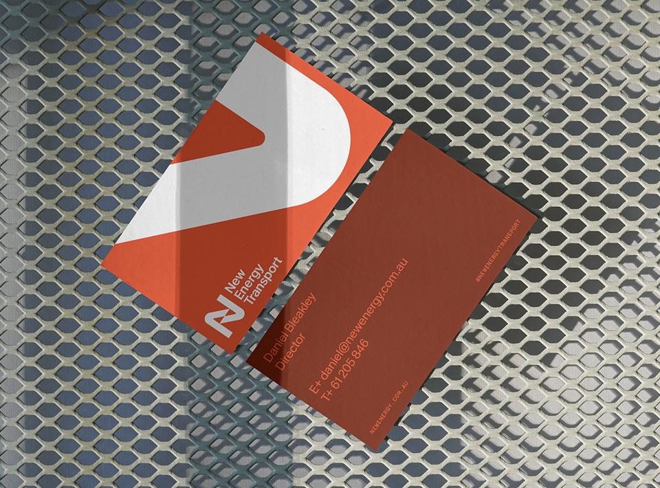
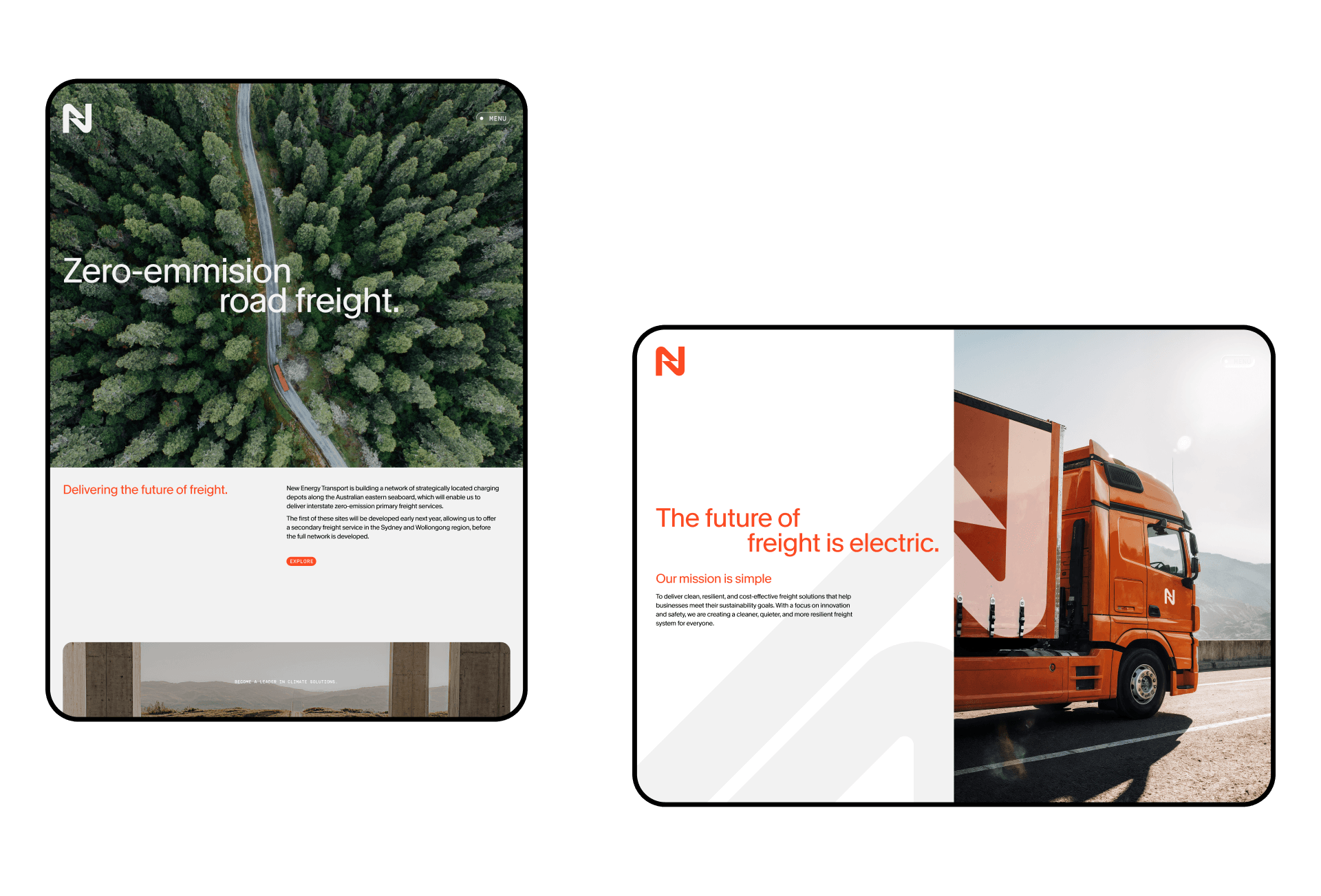
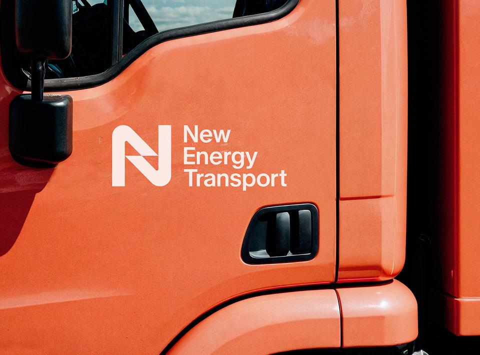
New Energy Transport needed a brand that could challenge an established and conservative industry without alienating the audiences it sought to transform. The identity was designed to feel fresh and innovative while also grounded and timeless. At its core is the logo-mark, which balances classic familiarity with progressive energy. It conveys motion and connection, and it serves as a strong anchor across every application, from trucks on highways to investor presentations.
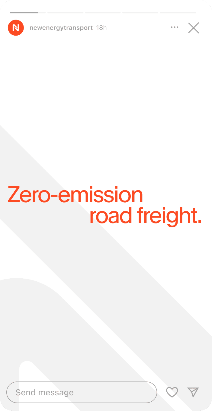
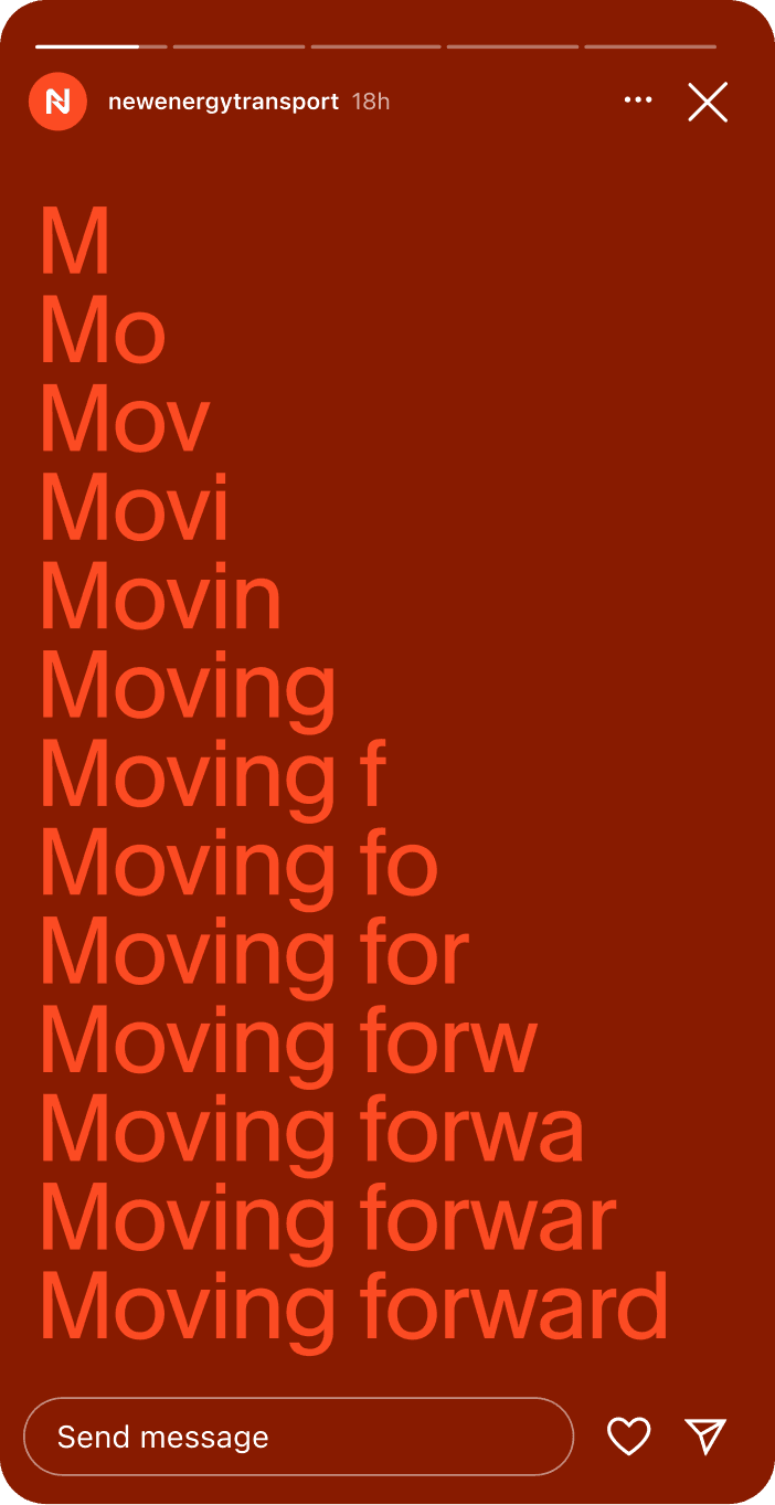
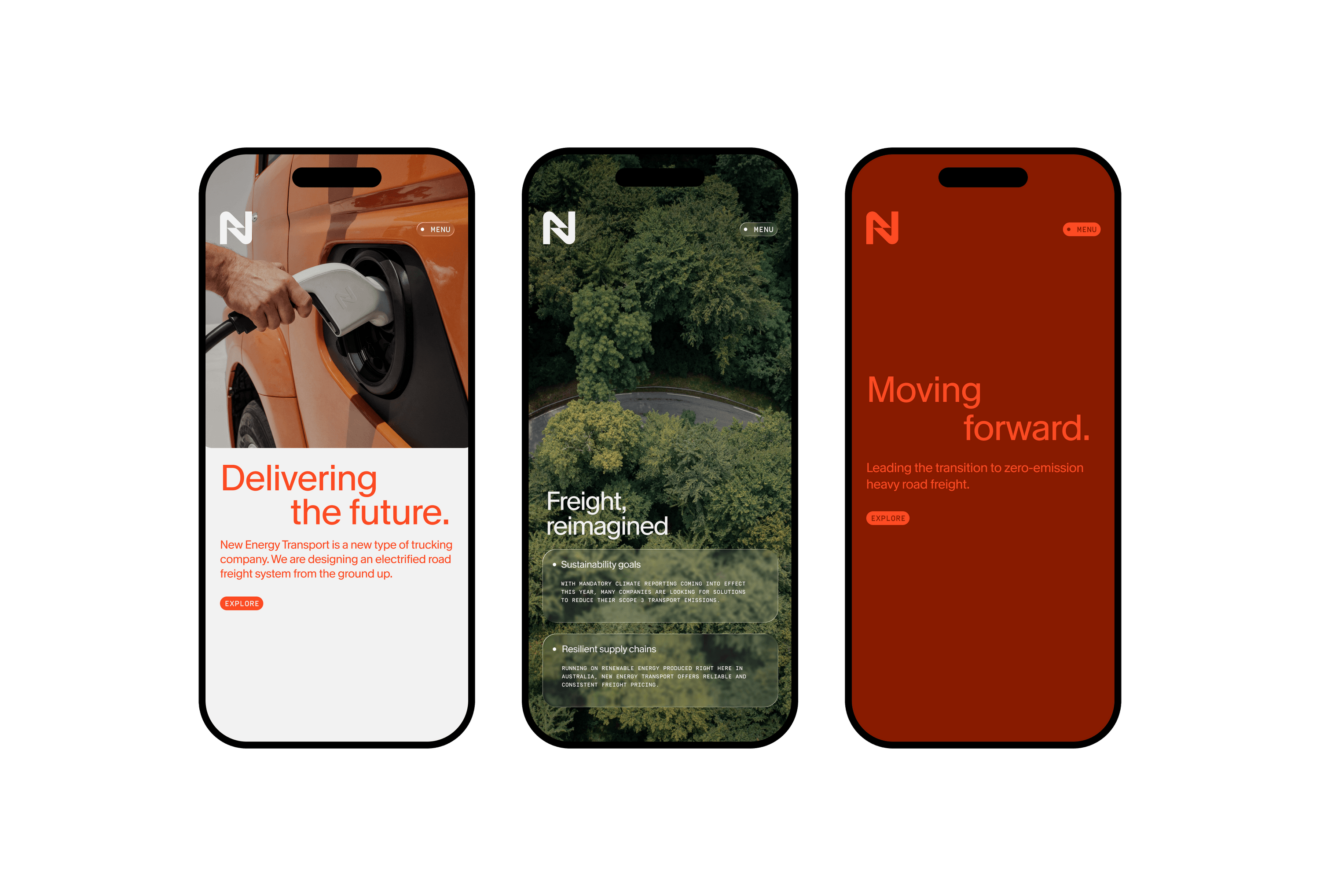
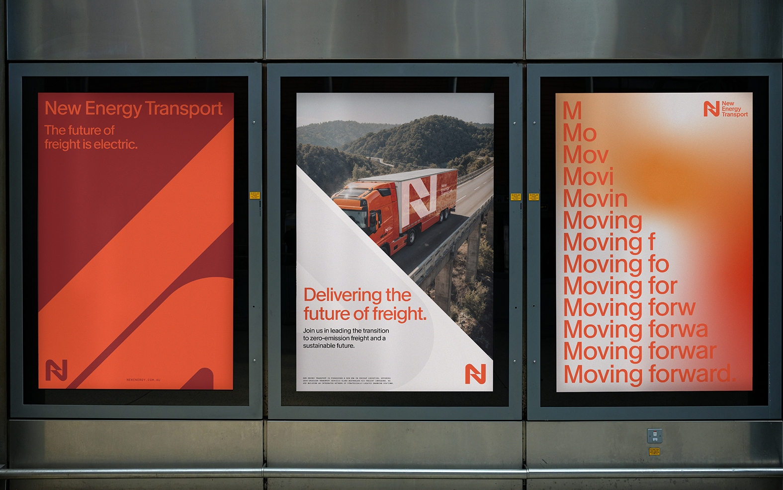
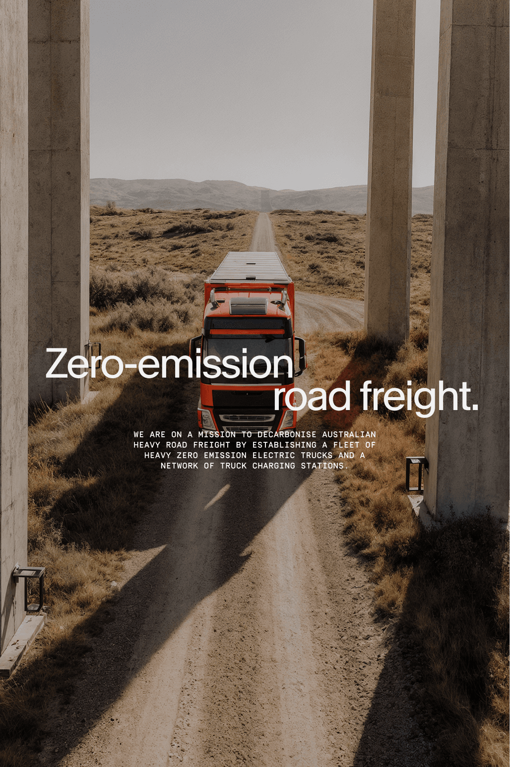
The design system builds on this balance of tradition and innovation. The colour palette is inspired by Australian landscapes and the visual language of transport, but reinterpreted through a modern electric lens. The result is a set of tones that feel recognisable and trustworthy, yet distinct and forward-focused. Typography reinforces this duality, combining clarity with confidence, while cascading type treatments introduce a dynamic sense of speed and flow.
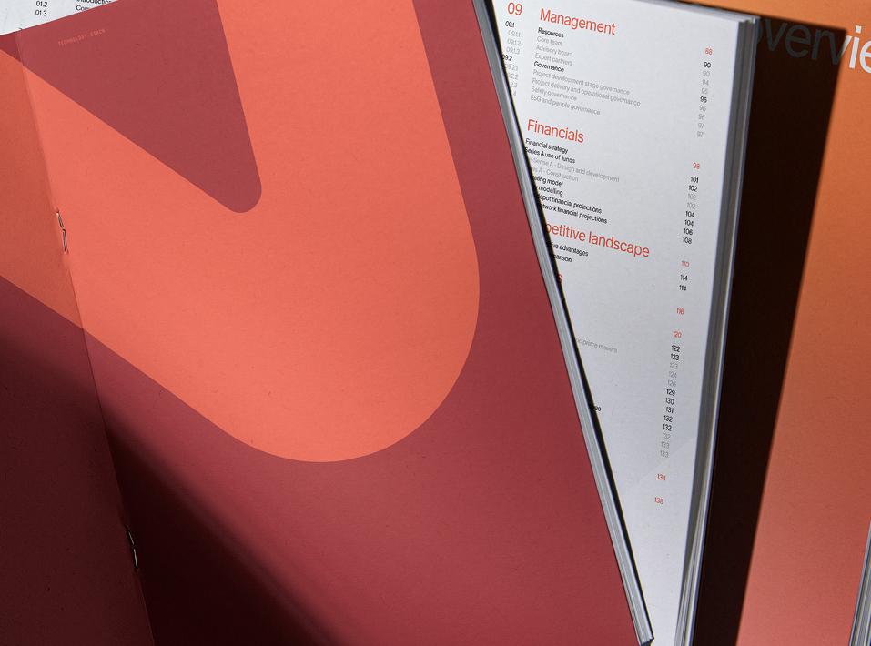
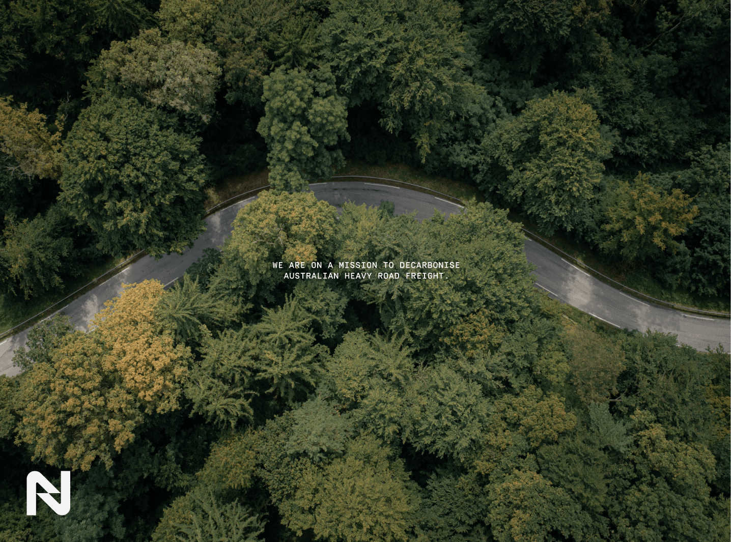
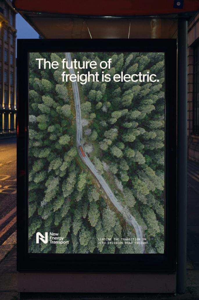
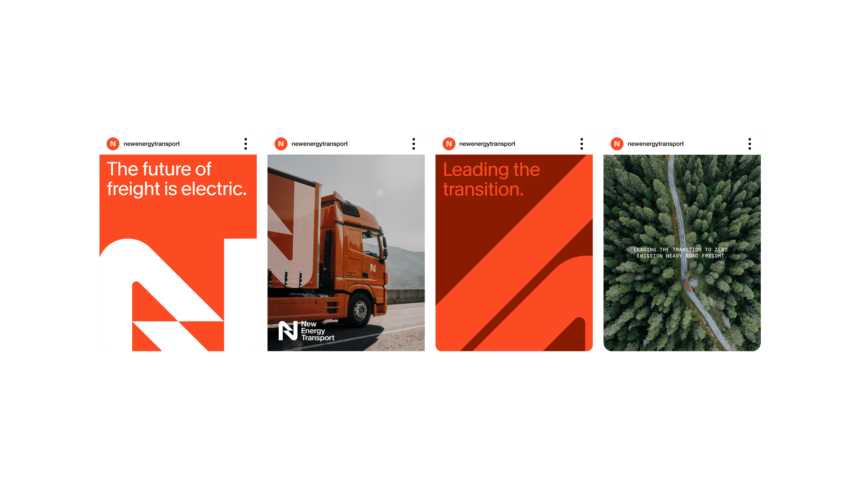
Graphic elements extend the language of movement. Inspired by the winding shapes of roads, networks and energy lines, they create a visual rhythm that mirrors the journey of freight itself. These devices bring consistency and momentum to layouts across print, digital and spatial environments. Photography is used sparingly to connect people and place, complementing the graphic language rather than leading it, and ensuring that the system remains scalable and cohesive.
The outcome is a brand identity that positions New Energy Transport as a leader in zero-emission freight while remaining accessible to a traditional market. By striking the balance between timeless and innovative, the system provides flexibility, visibility and impact across every platform. It is confident on the road, credible in the boardroom and future-focused in its vision — a brand built to lead Australia’s transition to cleaner, smarter freight.
