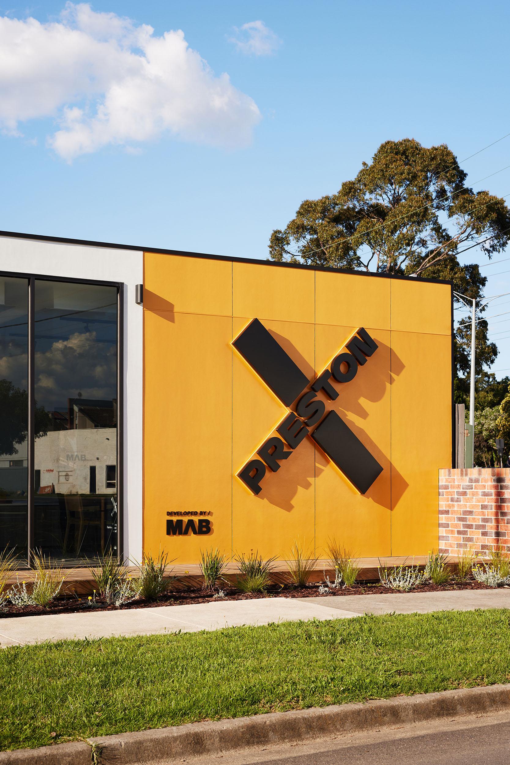
Preston Crossing
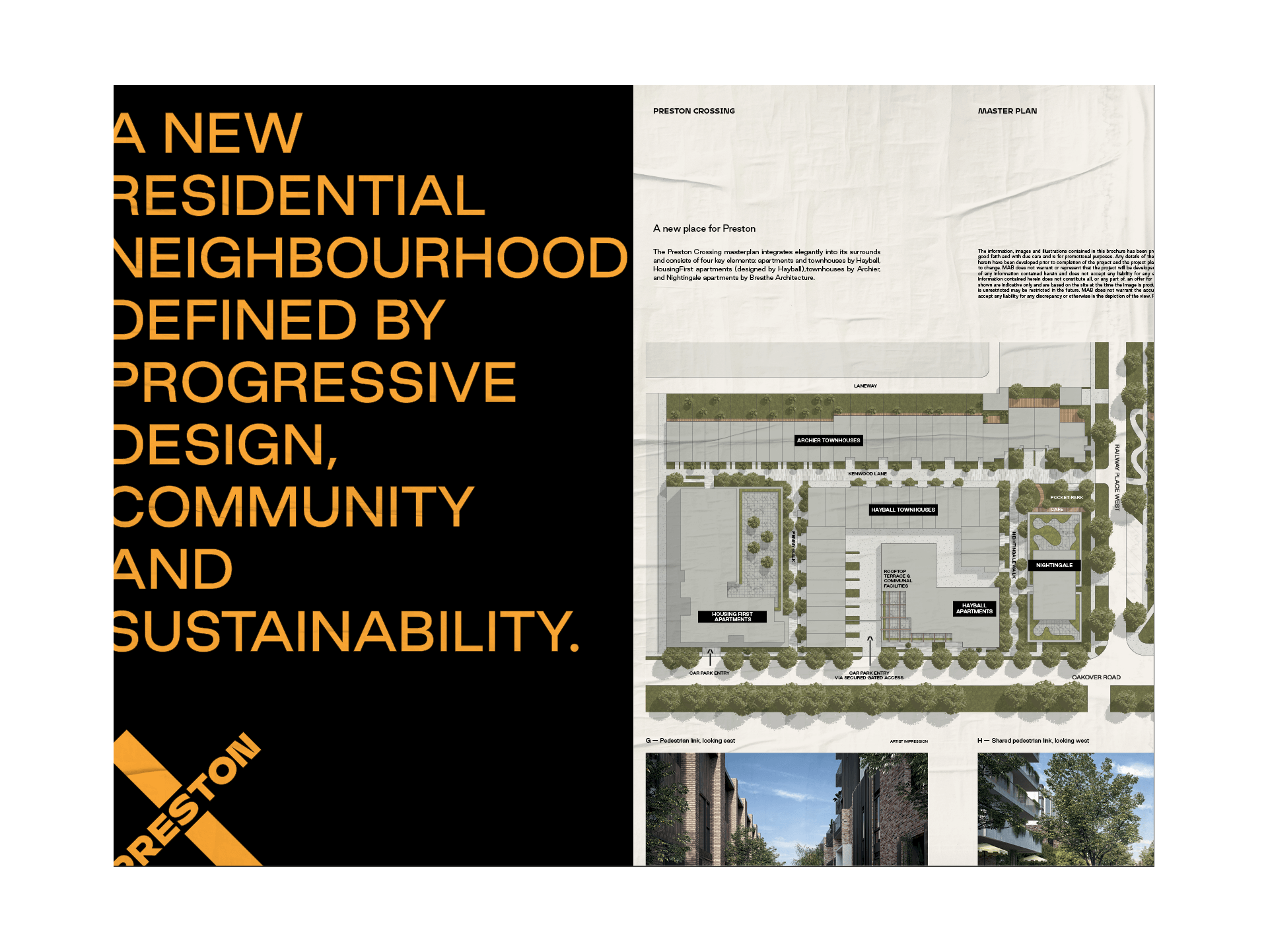
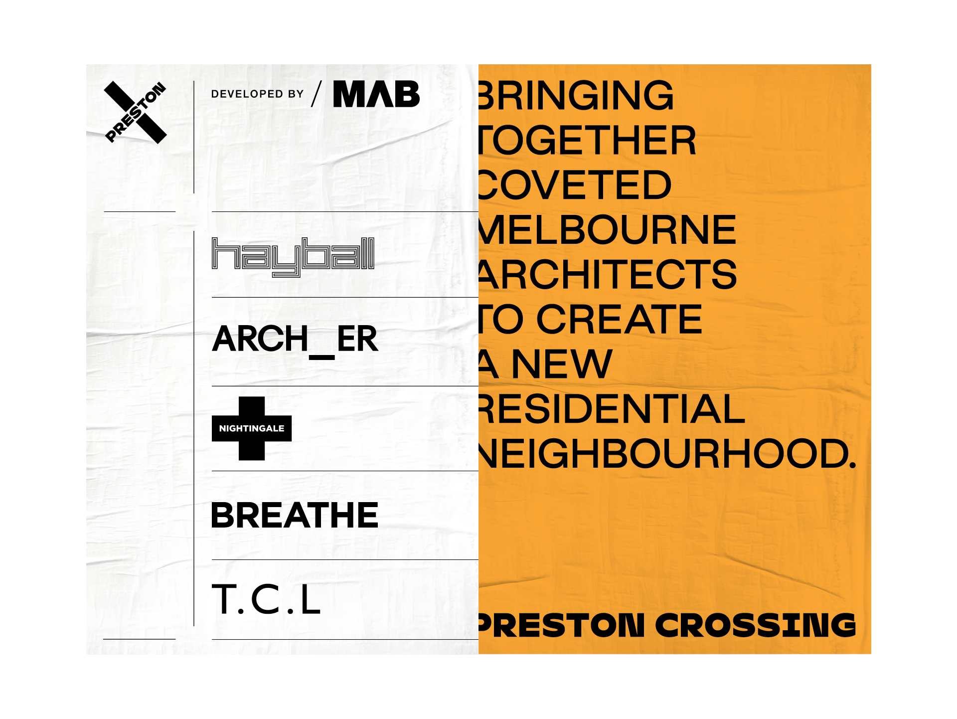
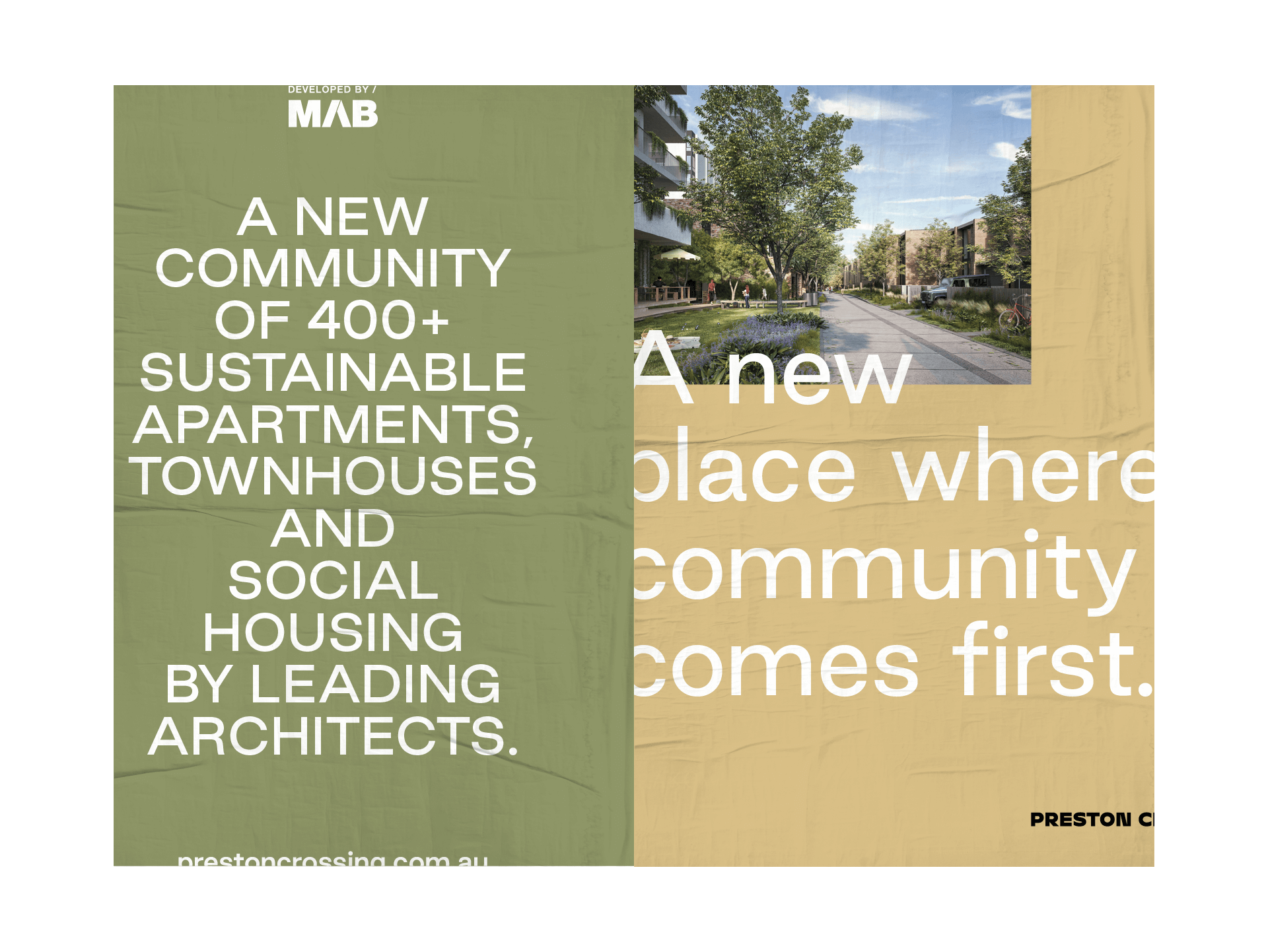
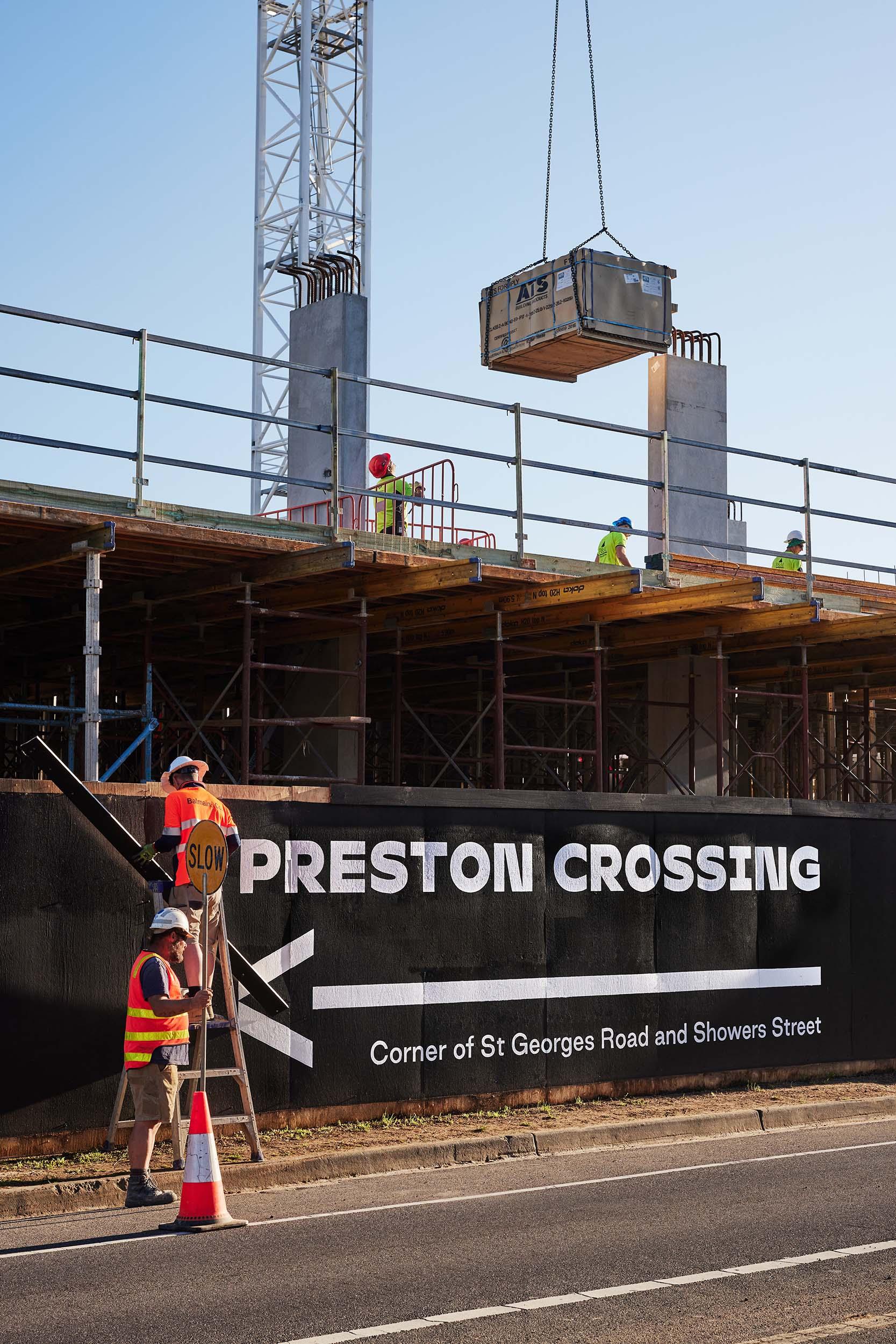
This unique project brings together leading Melbourne architects to create a new residential neighbourhood set over nine separate stages and two precincts.
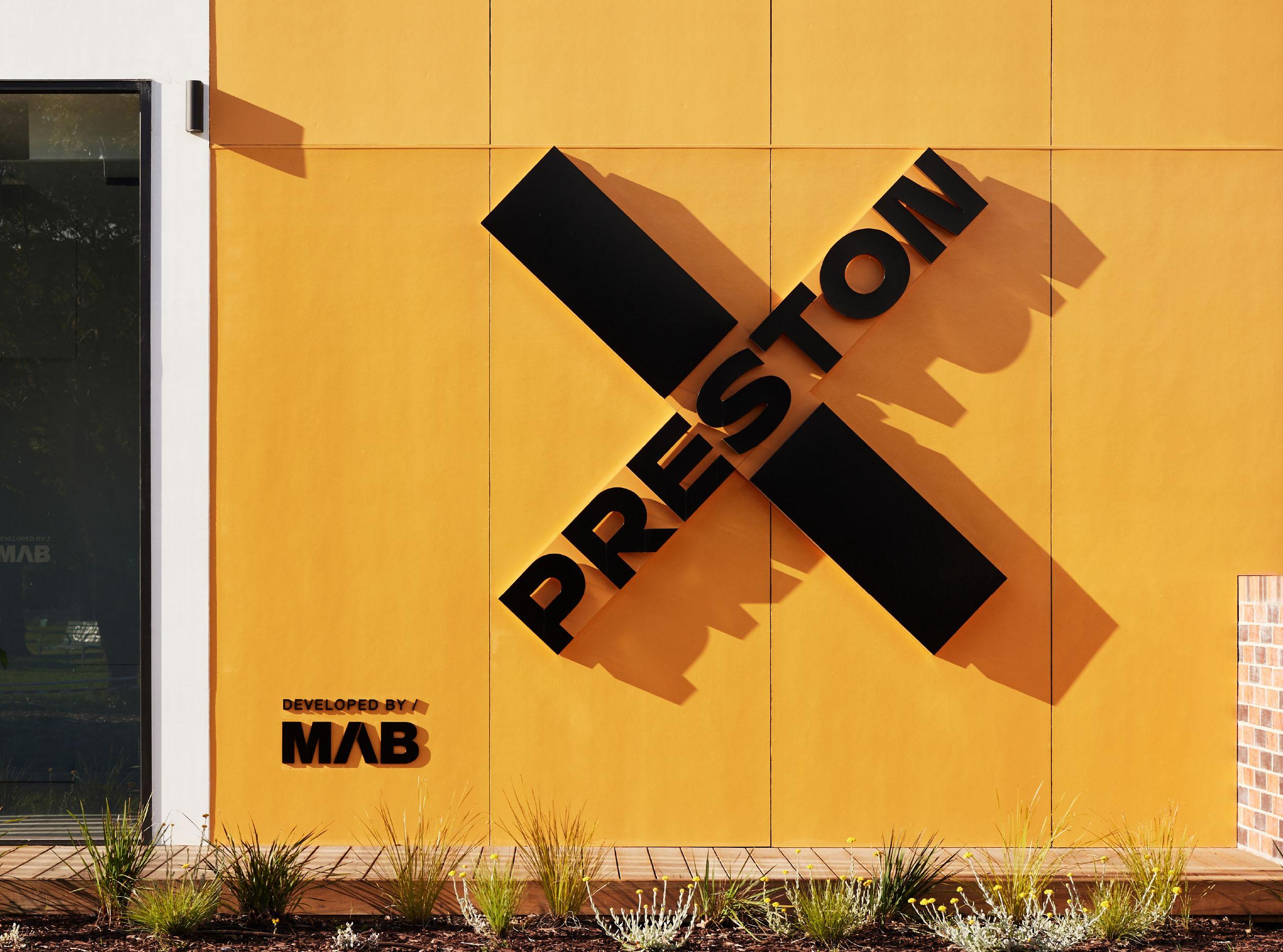
Driven by progressive design, community connections and a healthy environment, this ambitious masterplan by MAB required a brand that could speak to a range of offers and multiple releases, staged over many years.
Naming
Art Direction
Brand Identity
Printed Collateral
Digital Design
Spatial Design
Copywriting
Agent Tools
Digital Development
Hayball
Nightingale Housing
TCL
Housing First
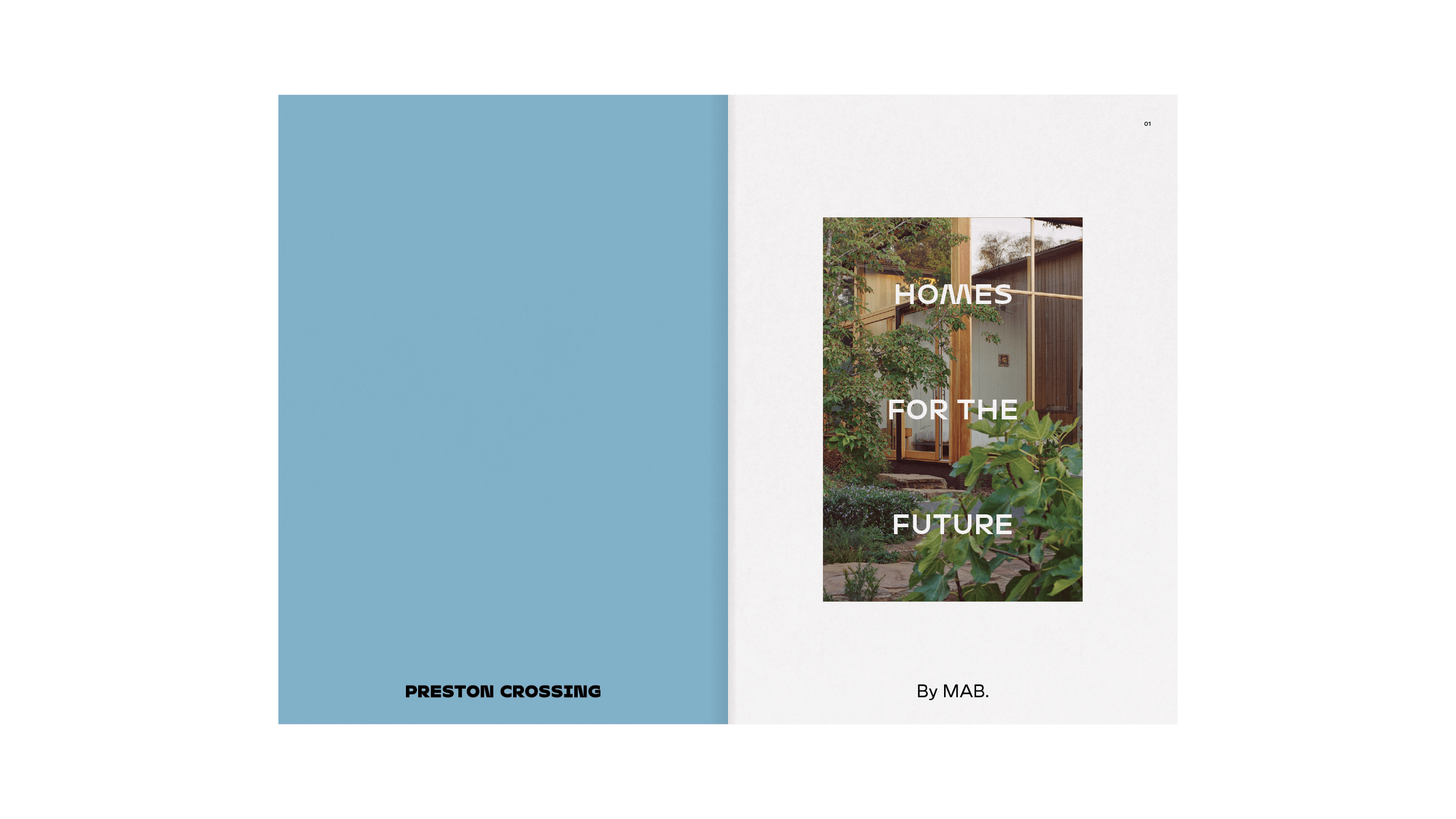
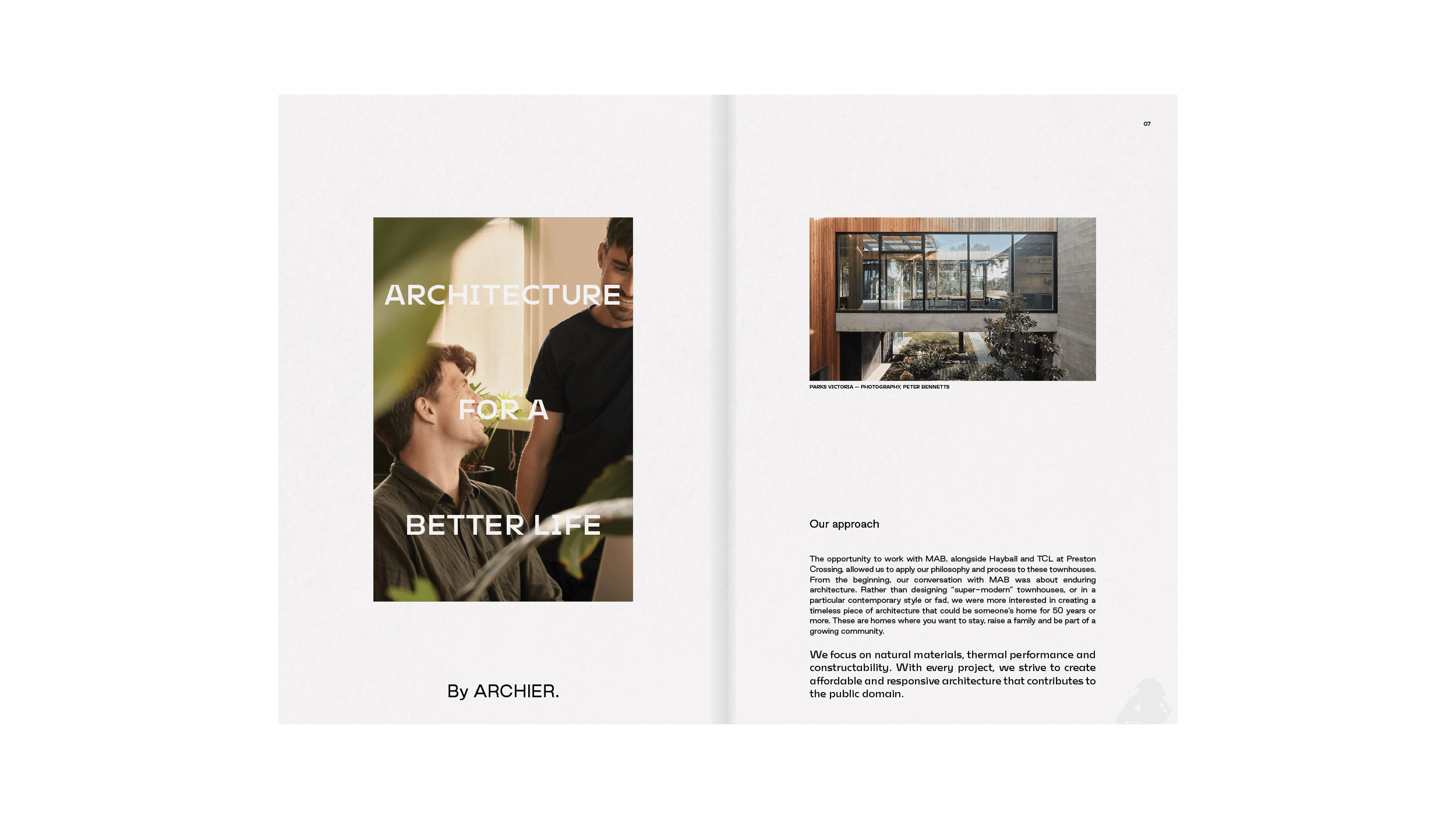
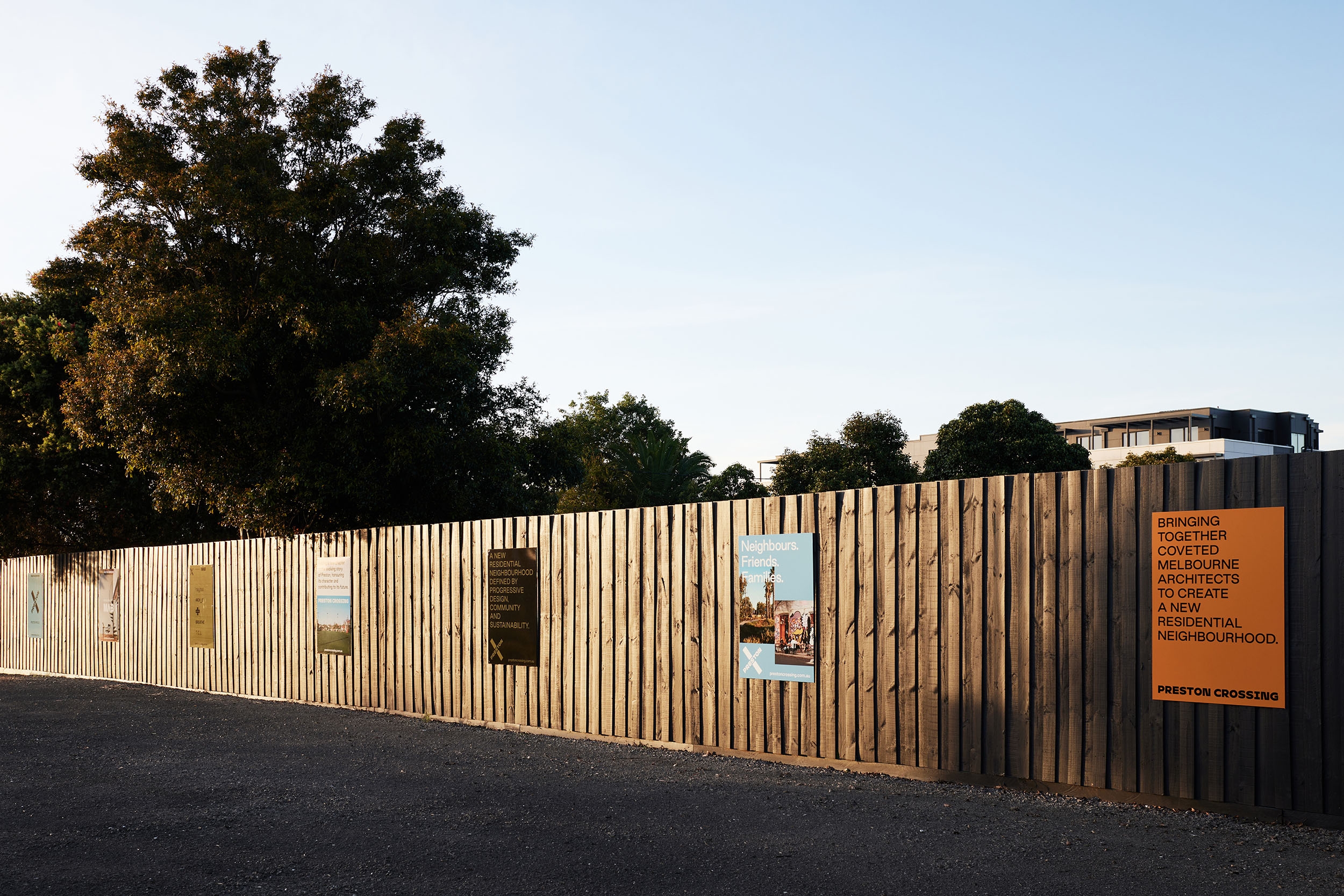
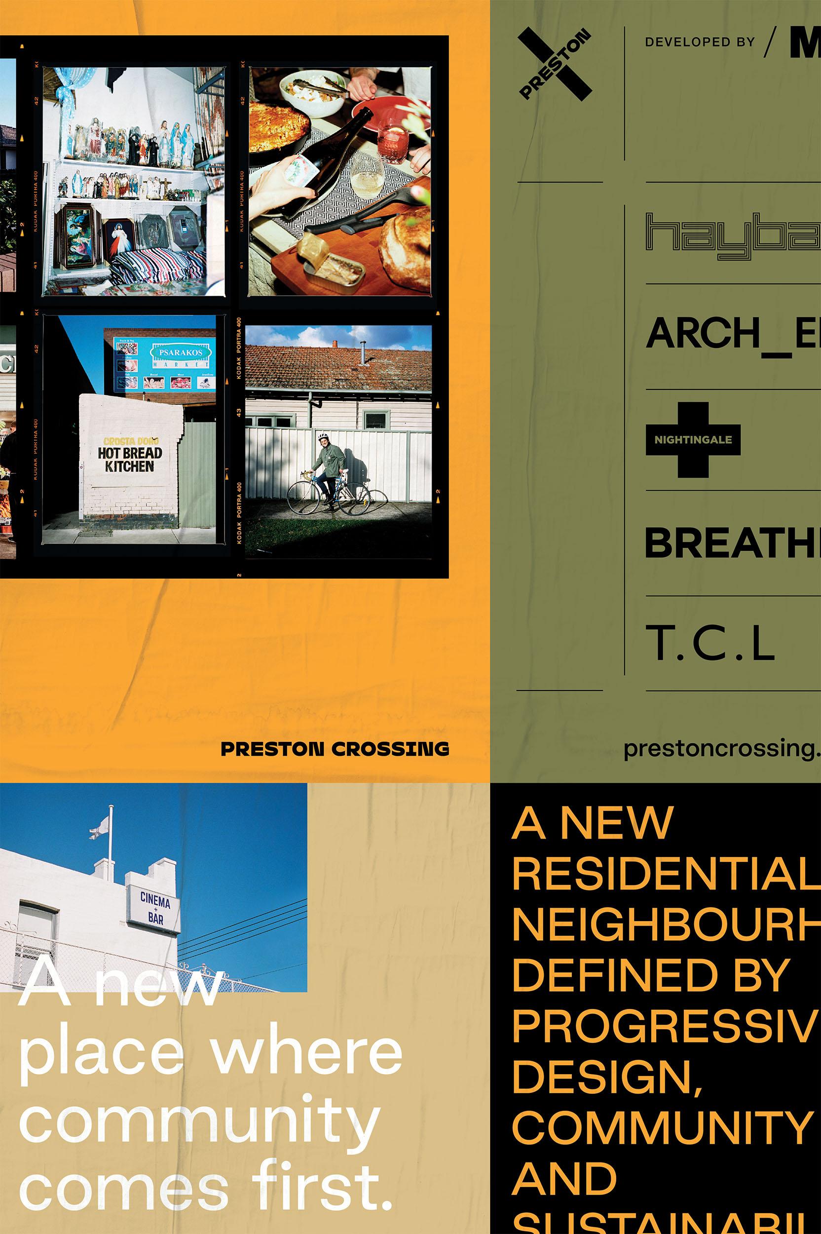
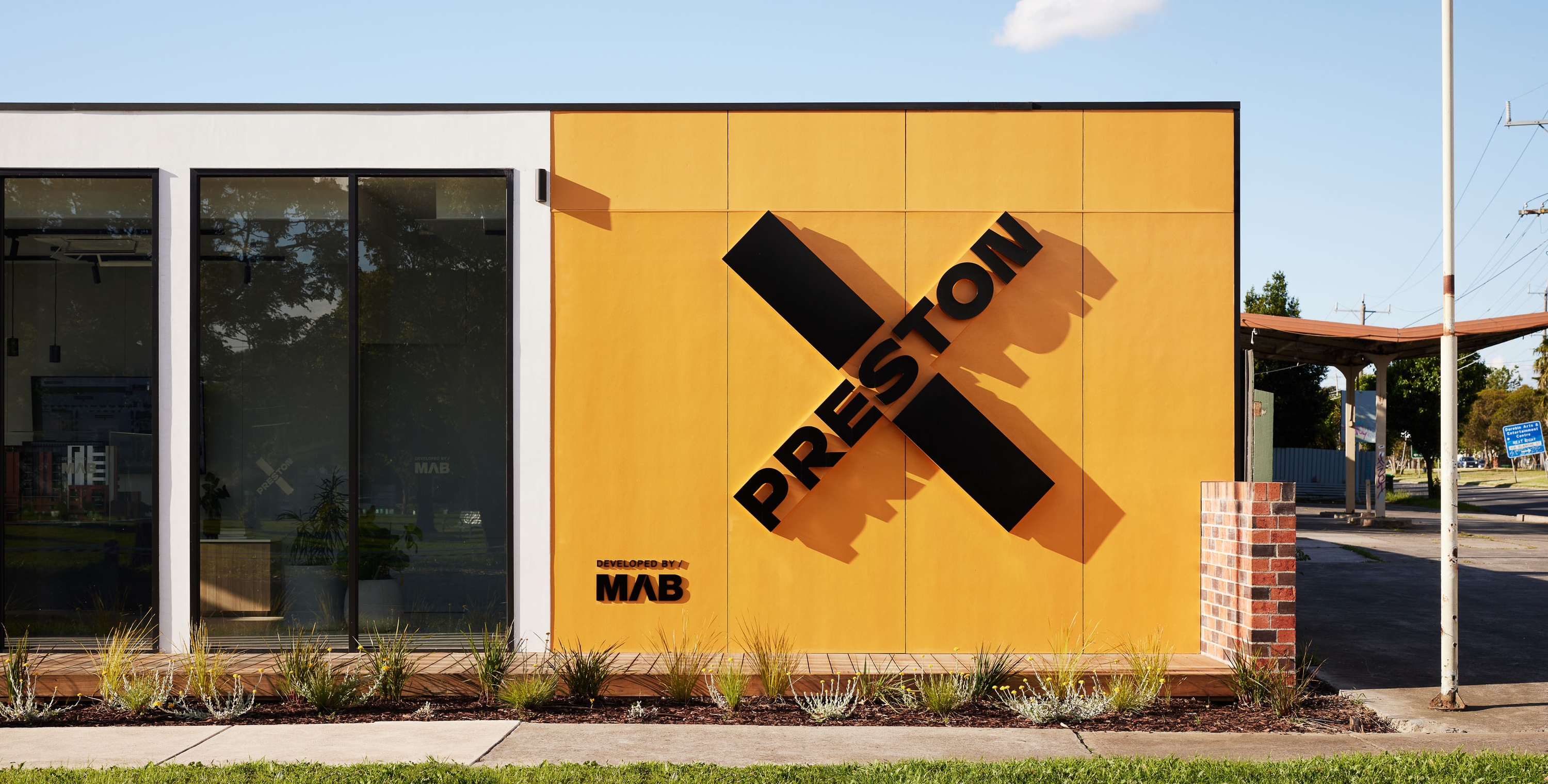
Seesaw developed a brand architecture that allowed MAB to hero architects, products and locations. Each release shares a visual language and a tone of voice inspired directly by Preston – a place its people are passionate to call home.
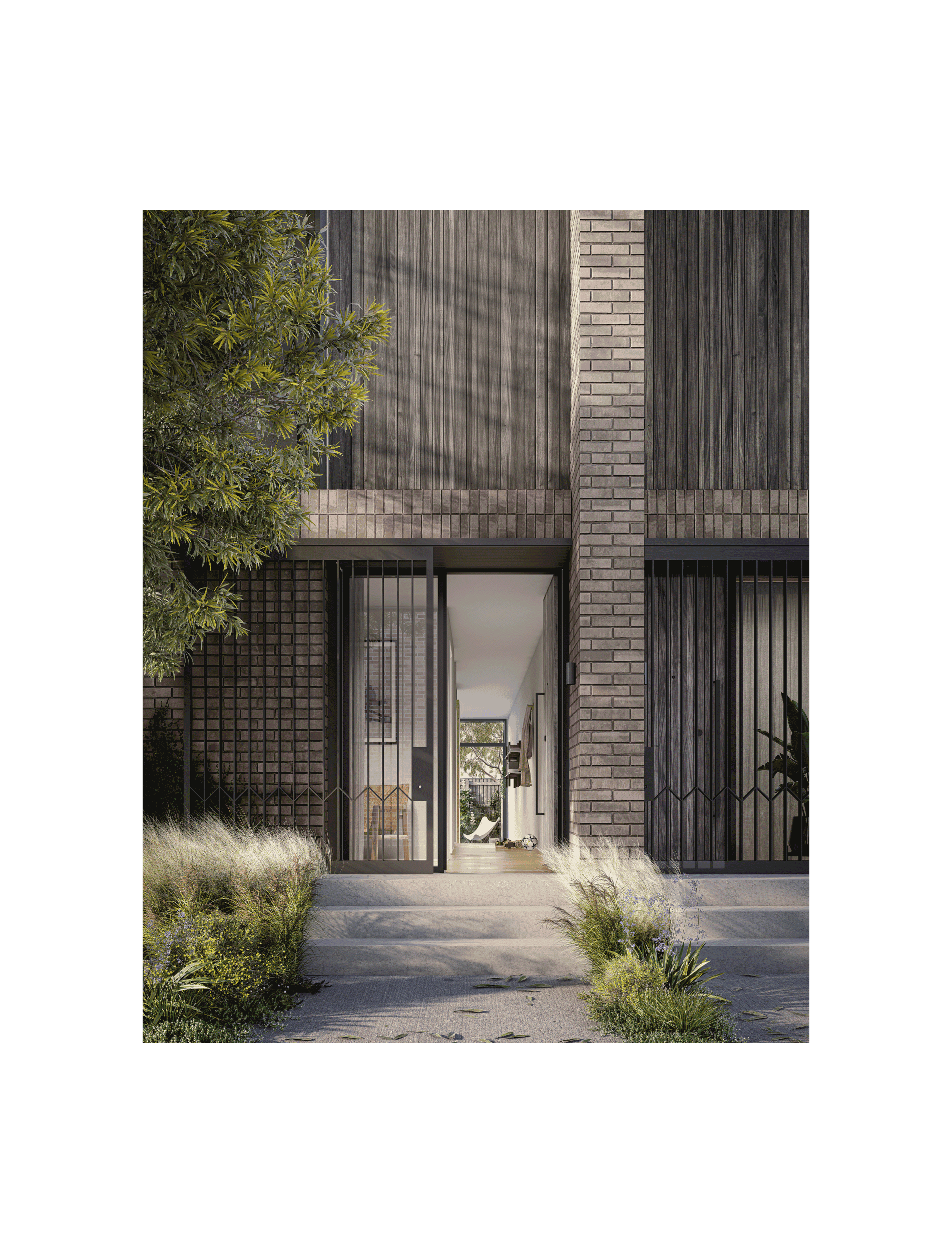
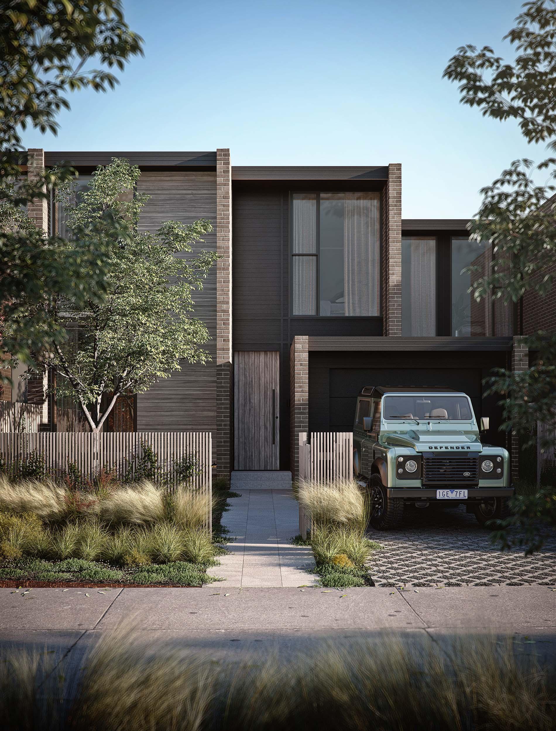
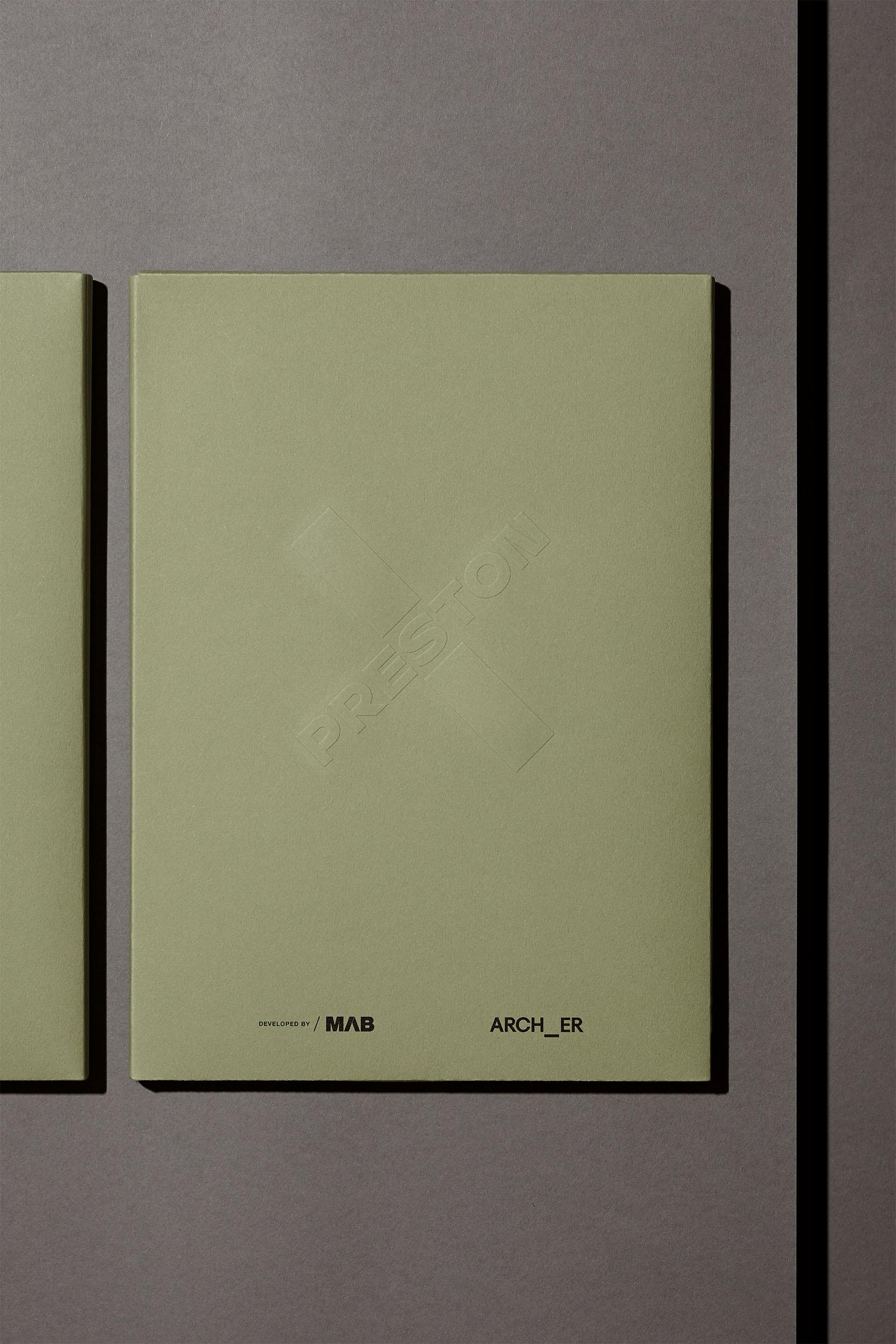
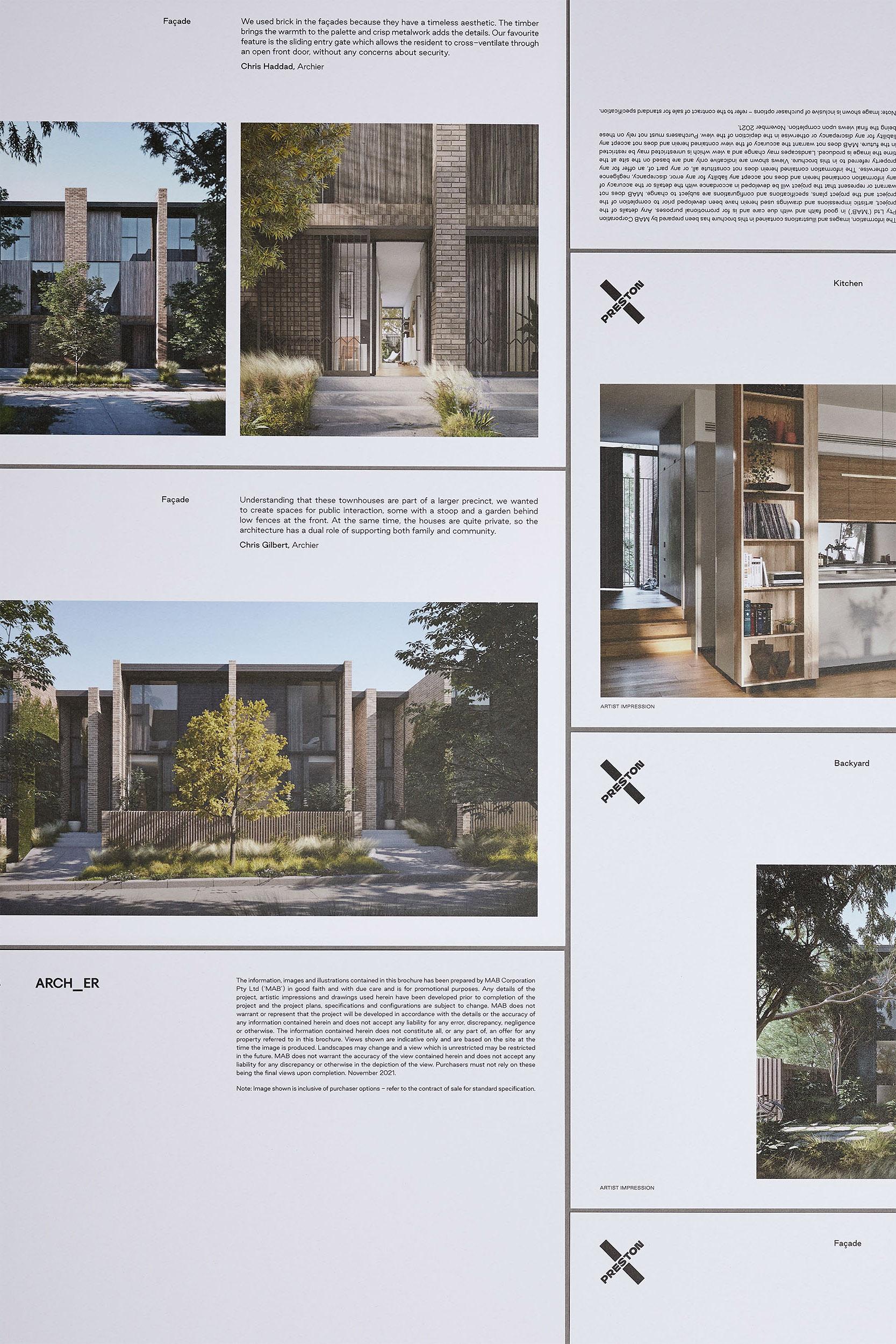
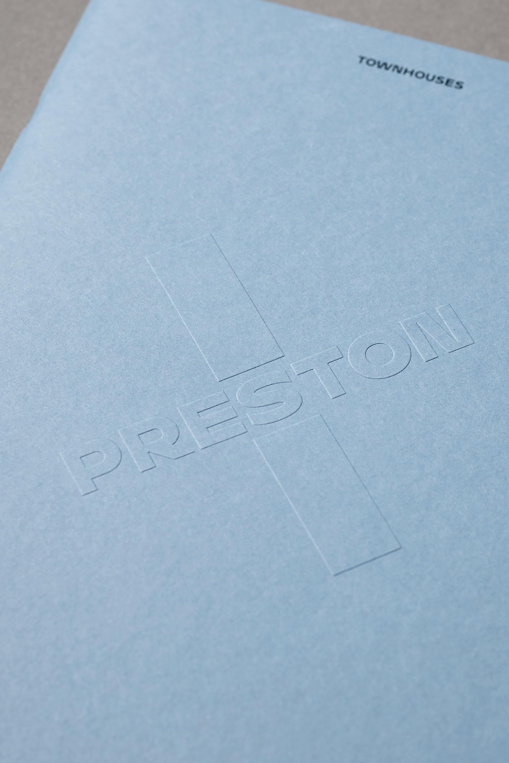
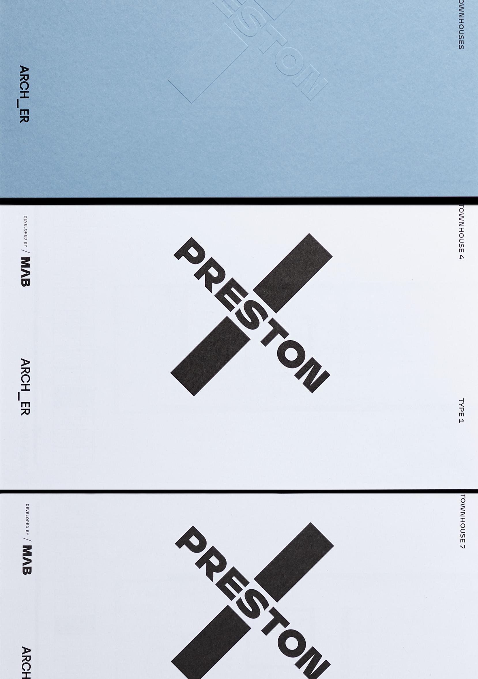
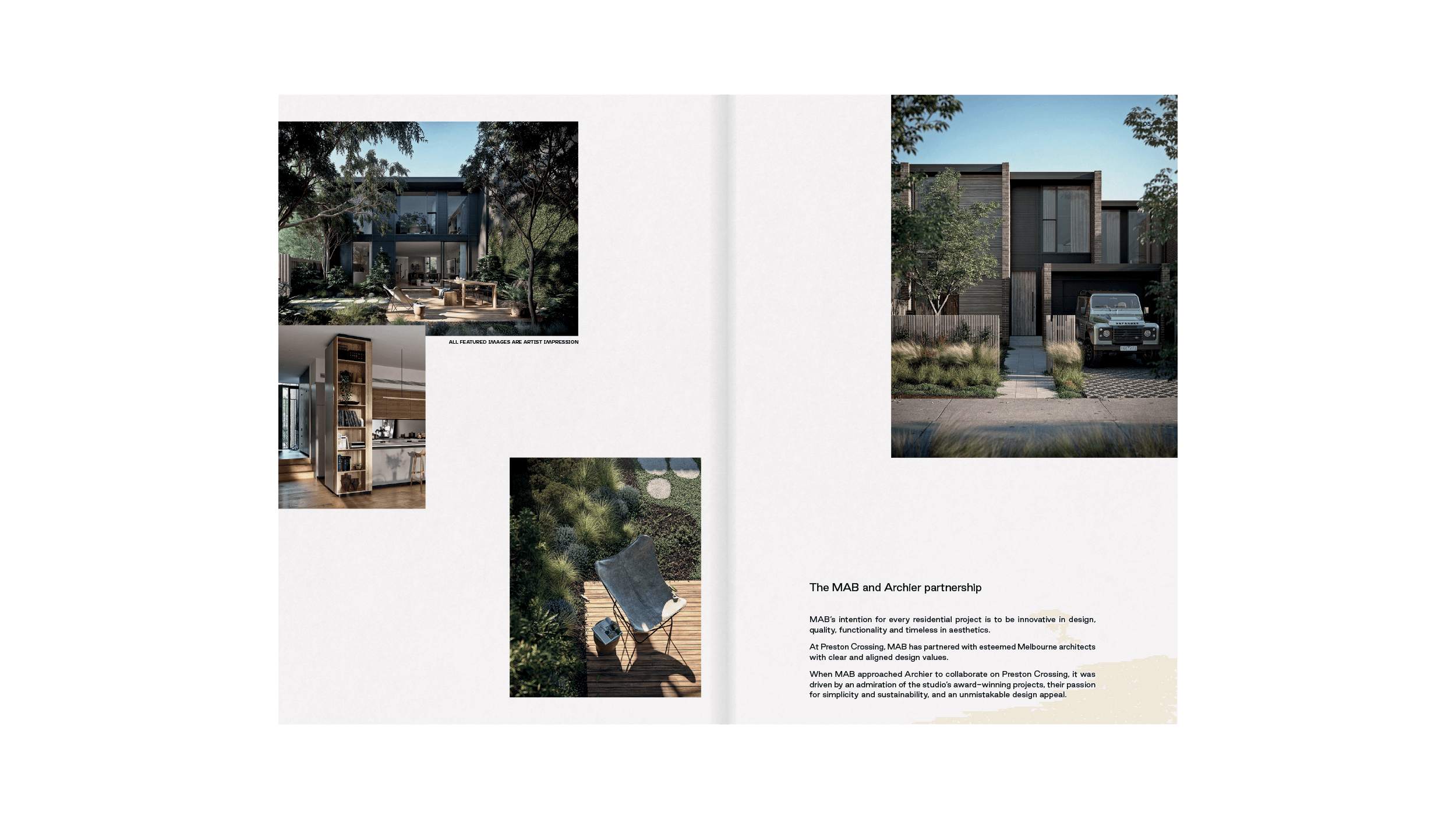
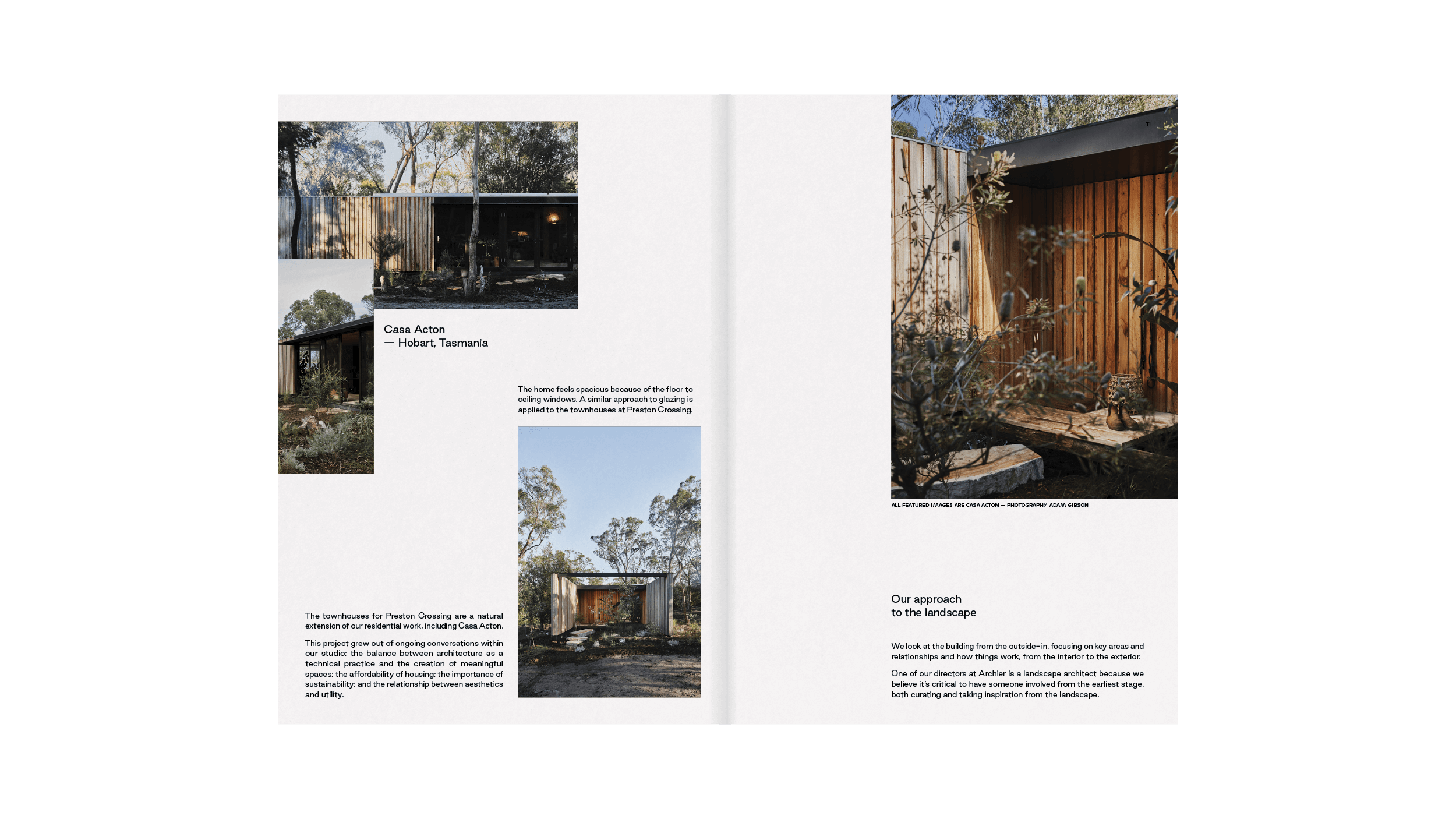
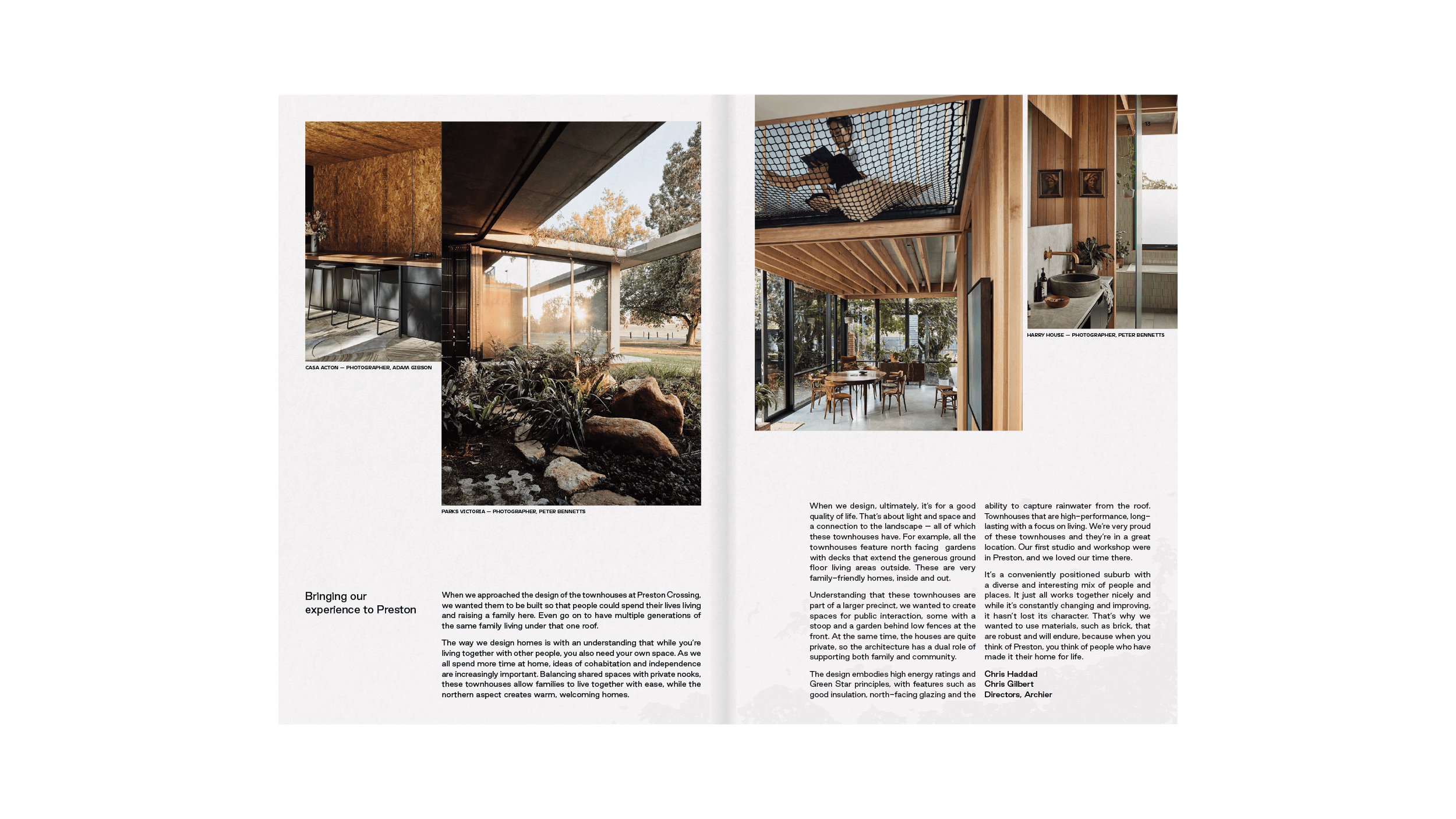
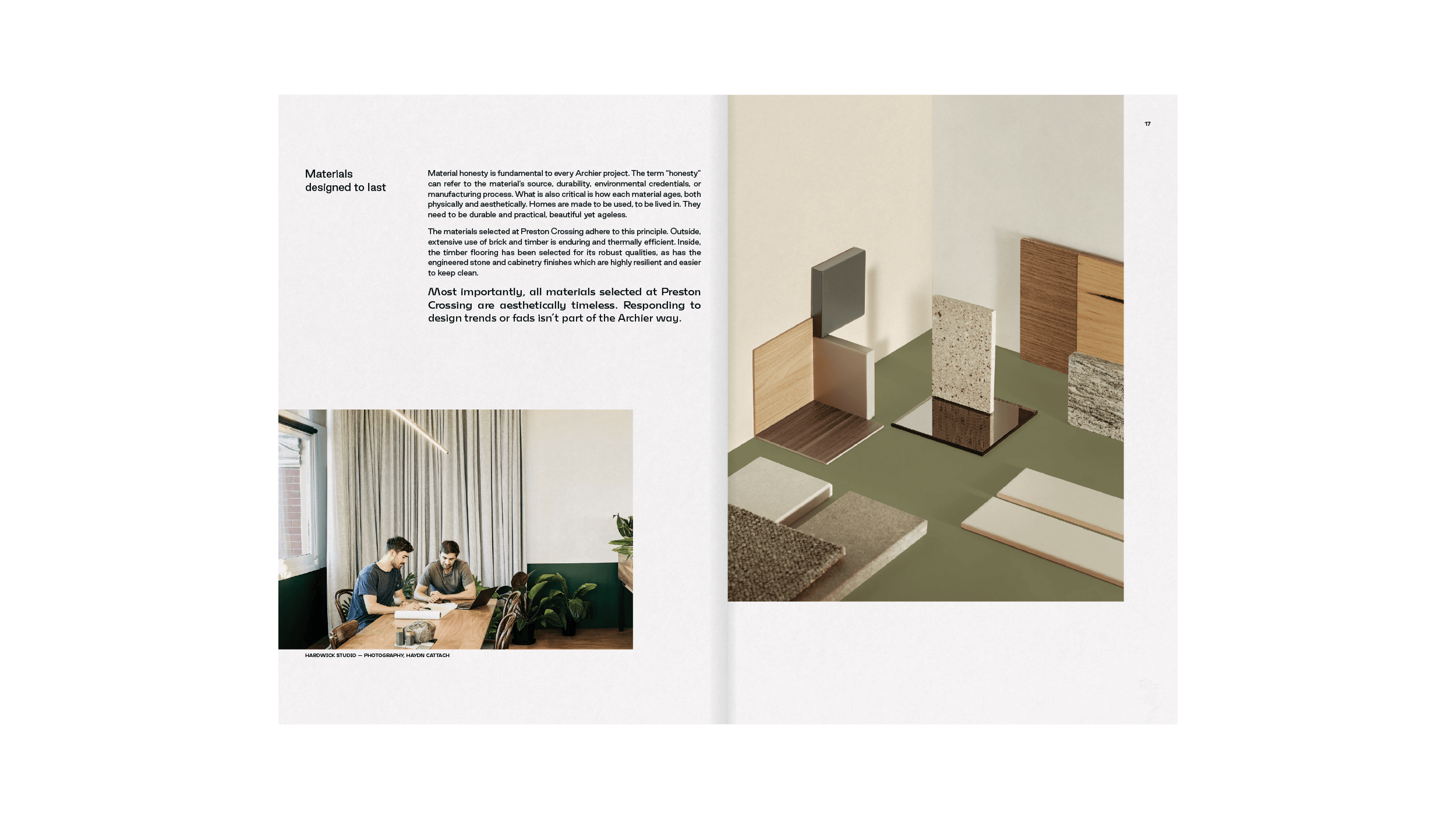
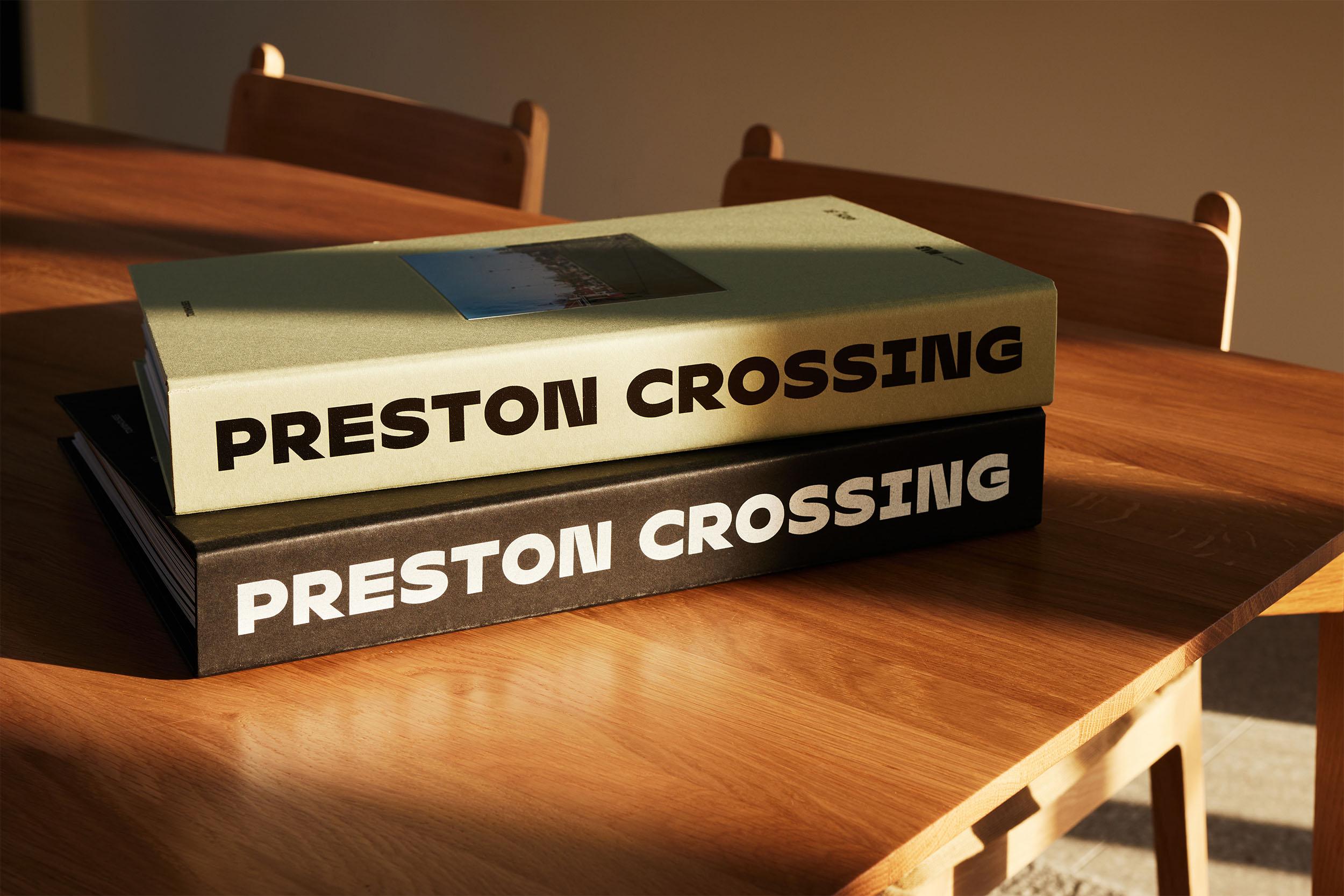
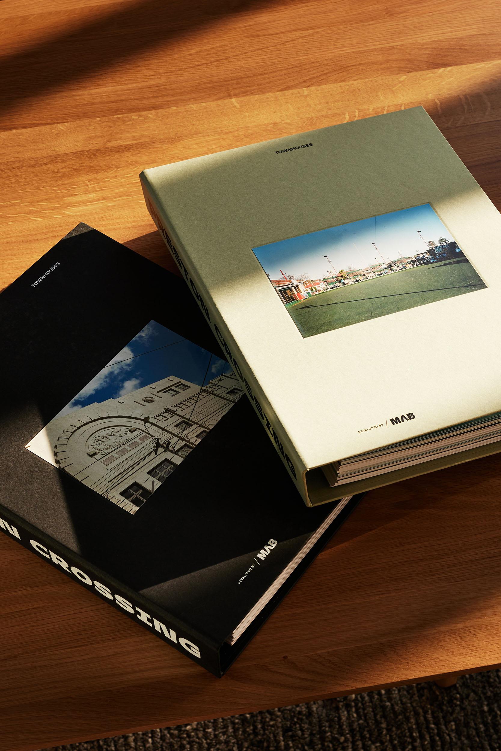
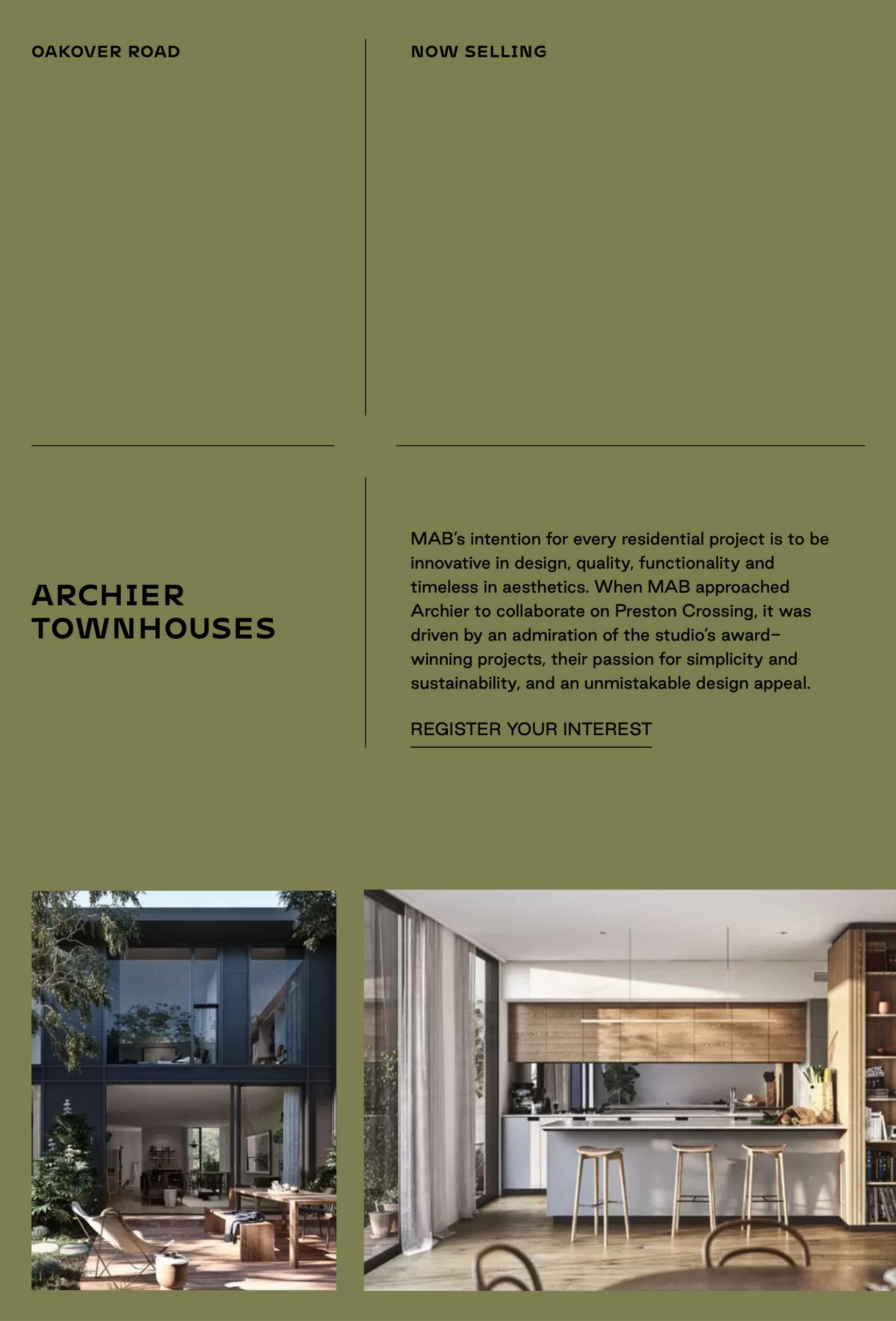
For the townhouses by Archier, the traditional brochure format was reconsidered to create a series of render cards with direct quotes on the vision, design and finishes from the architects themselves. This collection of cards and the housing envelope were printed using sustainable stock.
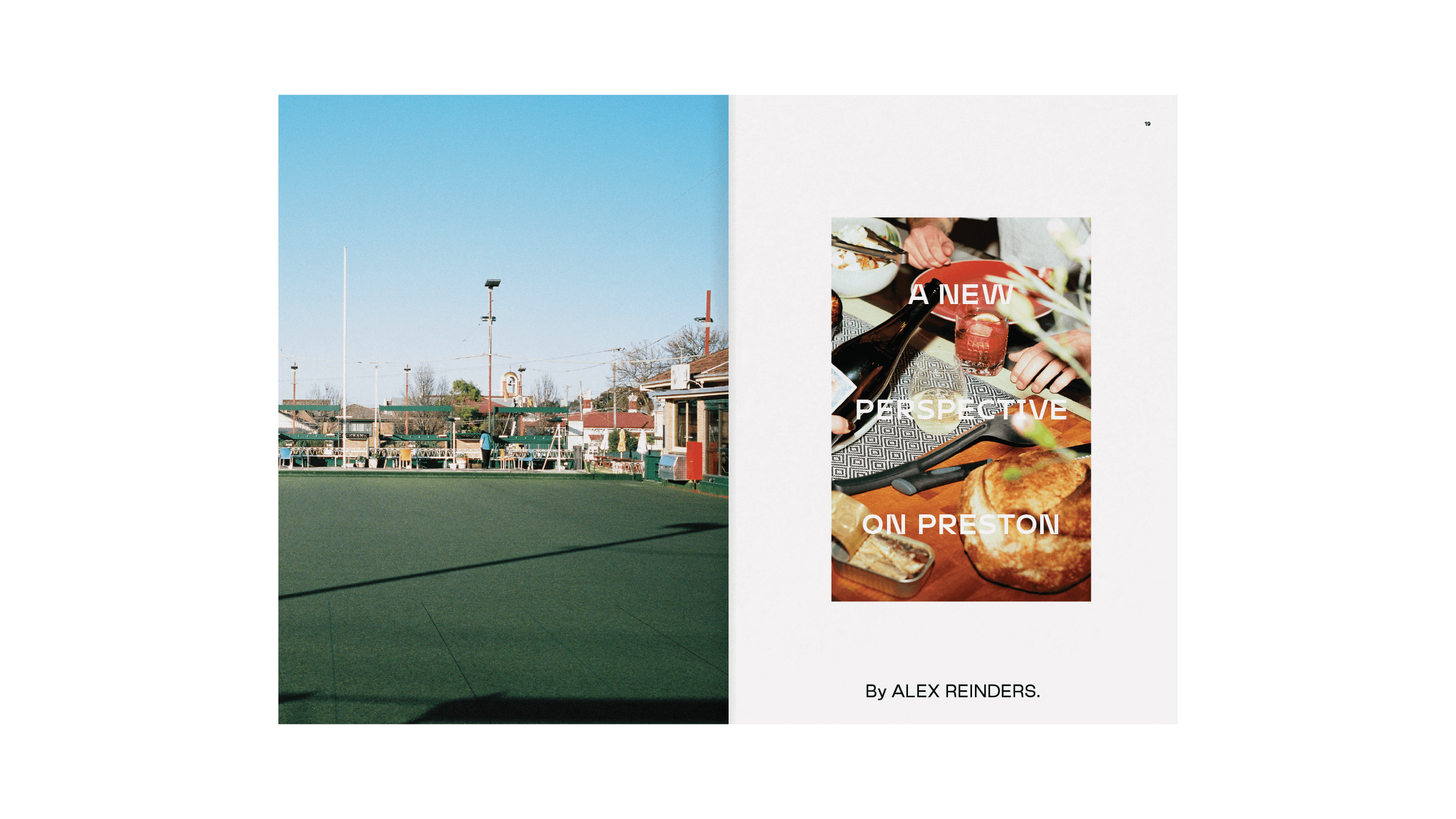
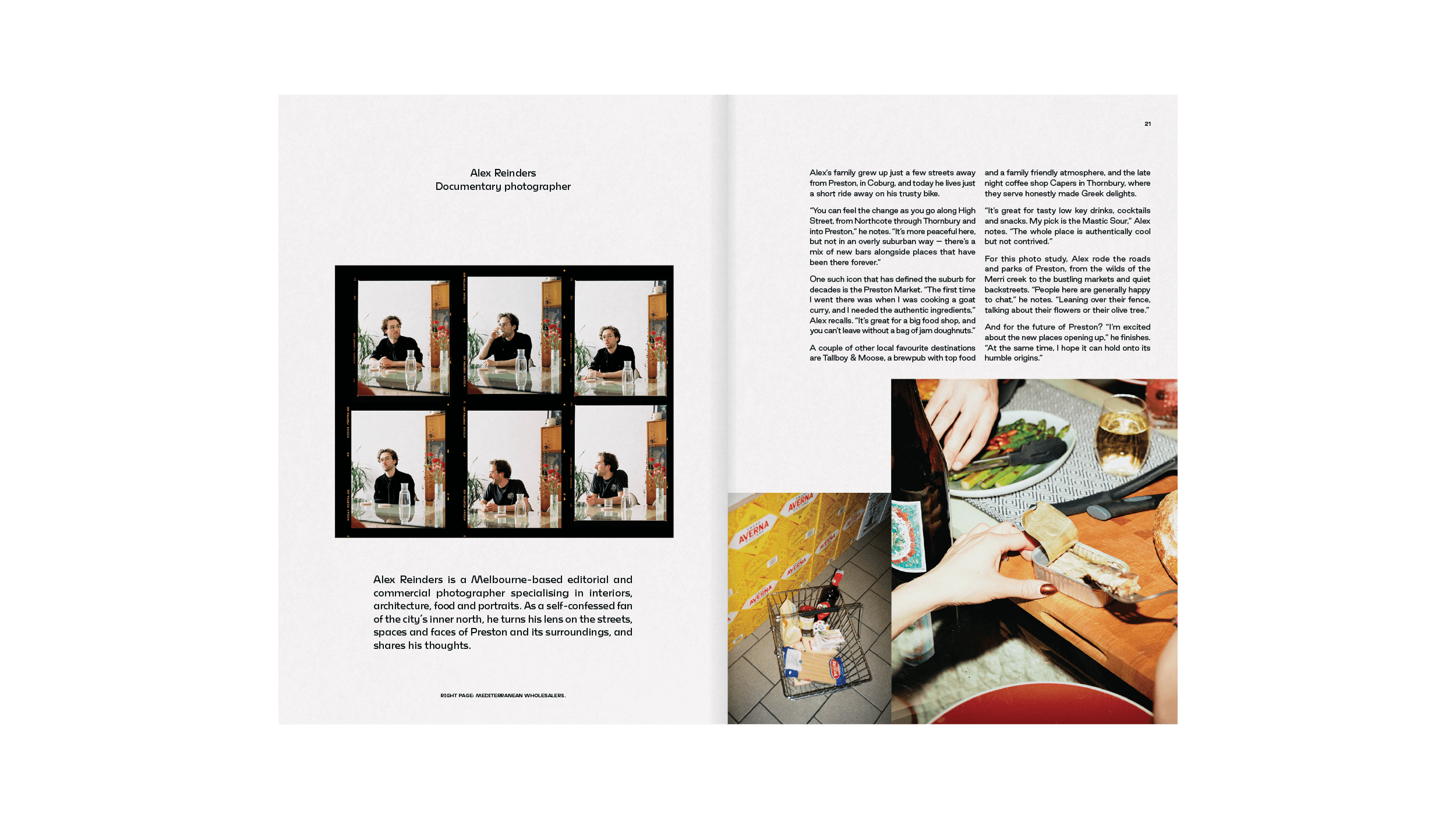
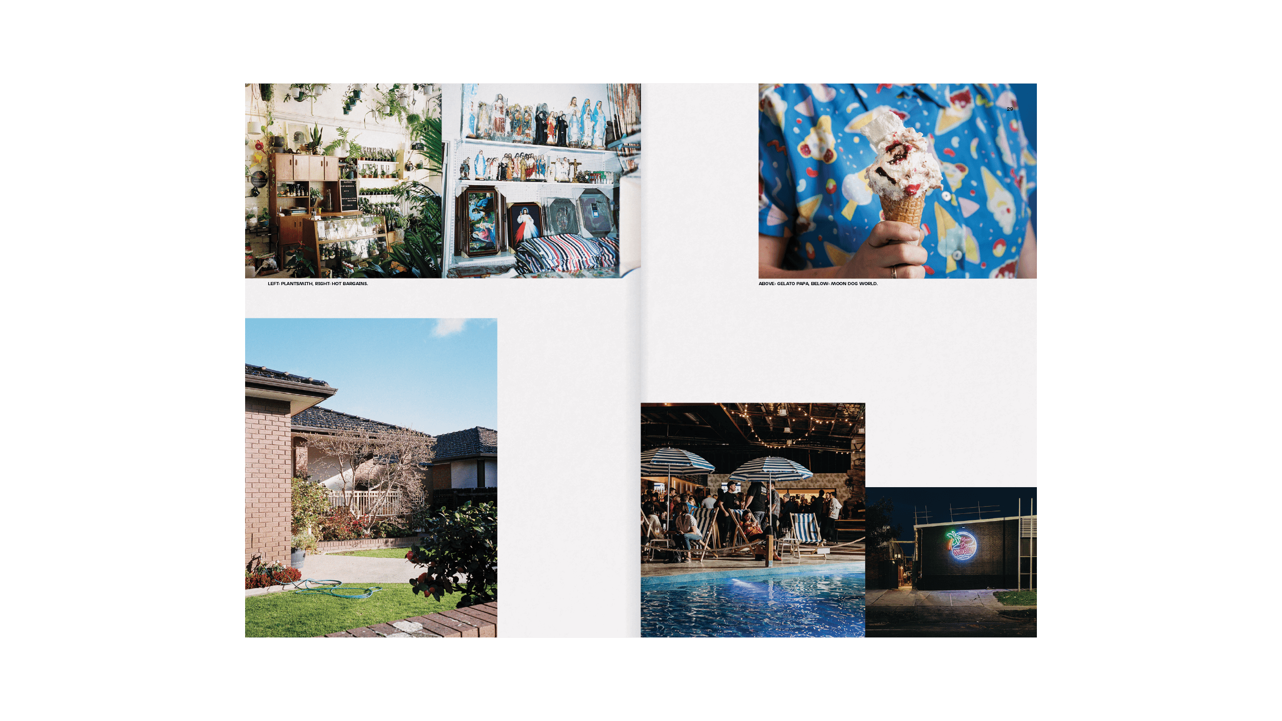
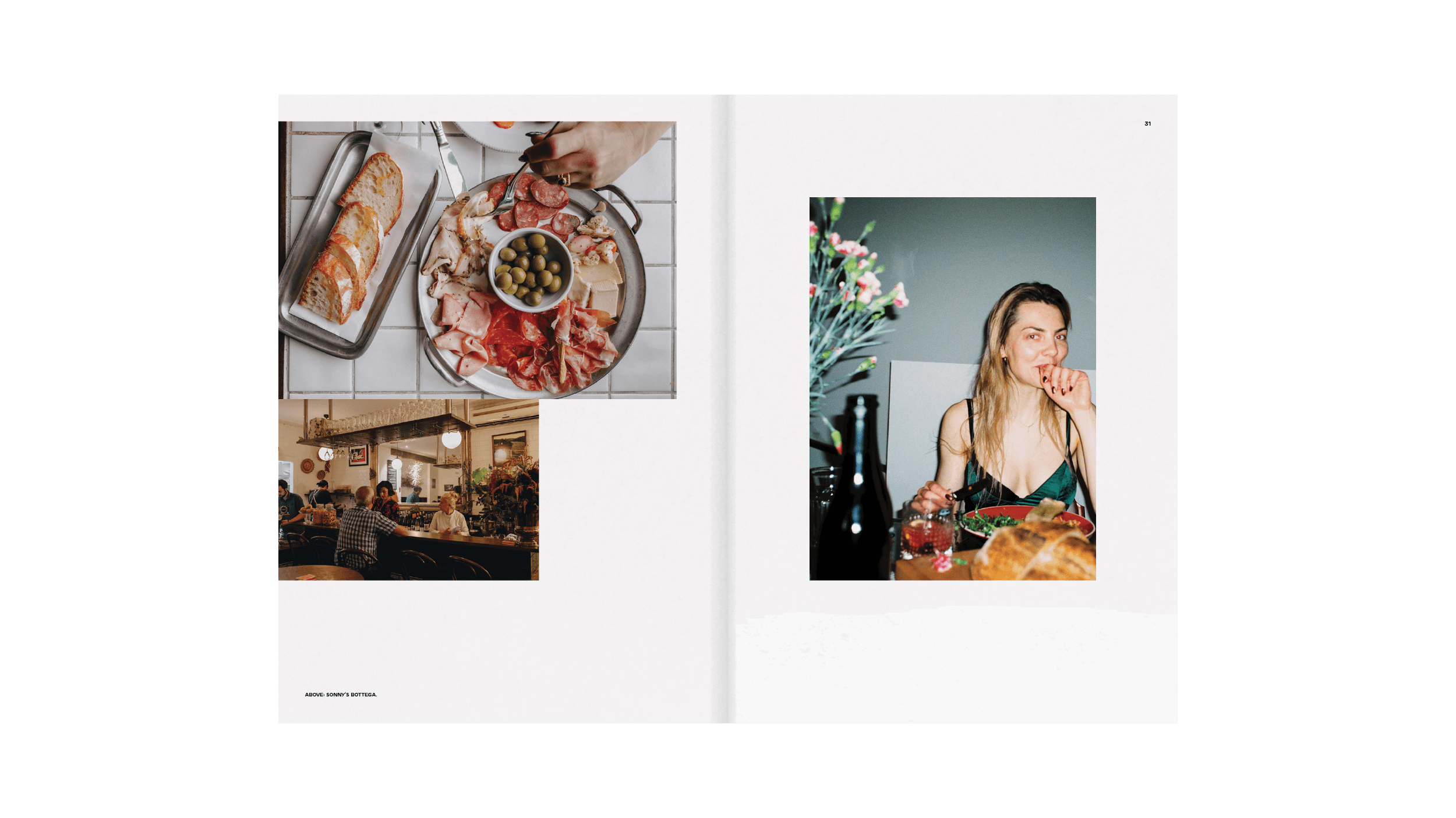
There’s an irrepressible spirit to Preston, which directly informed the creative direction, particularly the photography by Alex Reinders – a northside local who turned an authentic, unexpected and editorial film lens on the area.
