Slendier
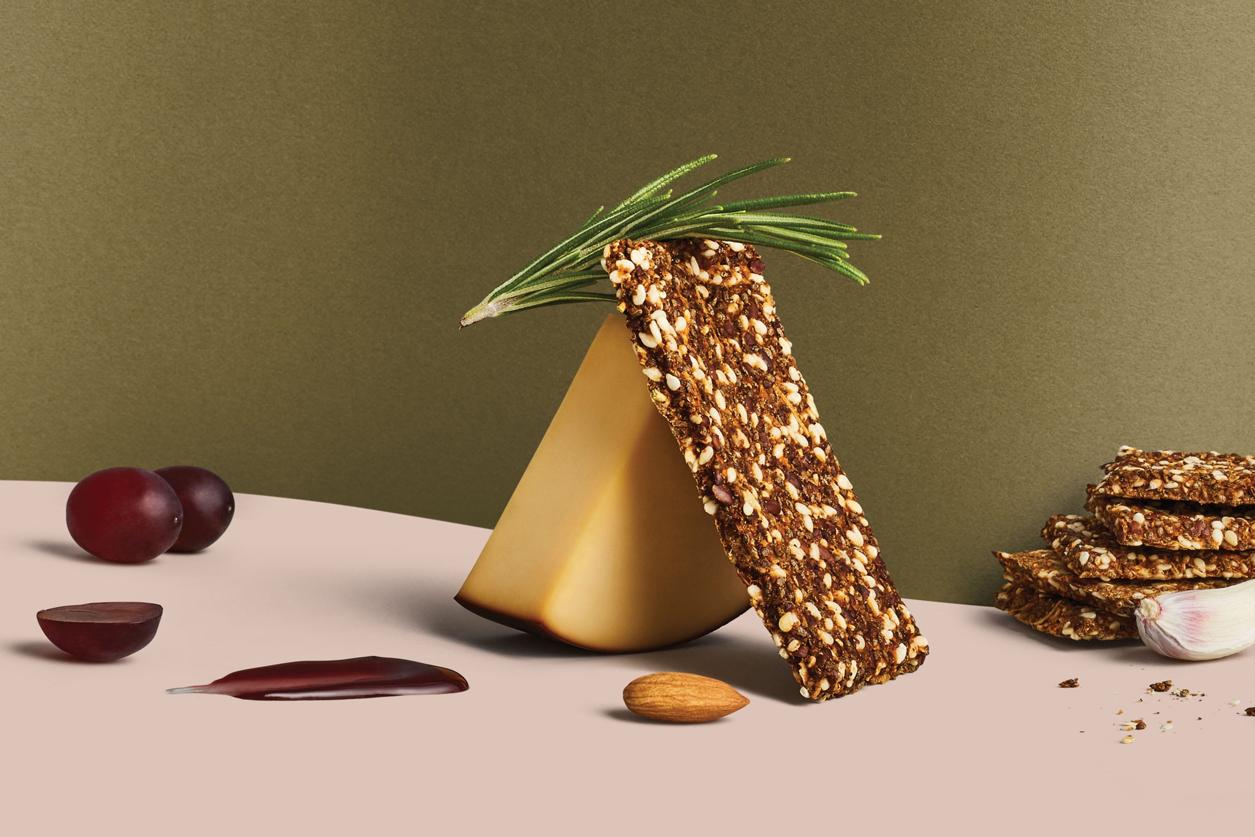
Established Australian FMCG manufacturer Slendier approached Seesaw to reposition and rebrand their extensive range of wellness foods. Moving away from a weight-loss style brand, the new strategy repositioned Slendier as a premium yet everyday alternative with a focus on positive vibes over guilt — making every day a good food day.
Brand Identity
Art Direction
Printed Collateral
Packaging Design
Photography
3D Visualisation
Illustration
James Lake
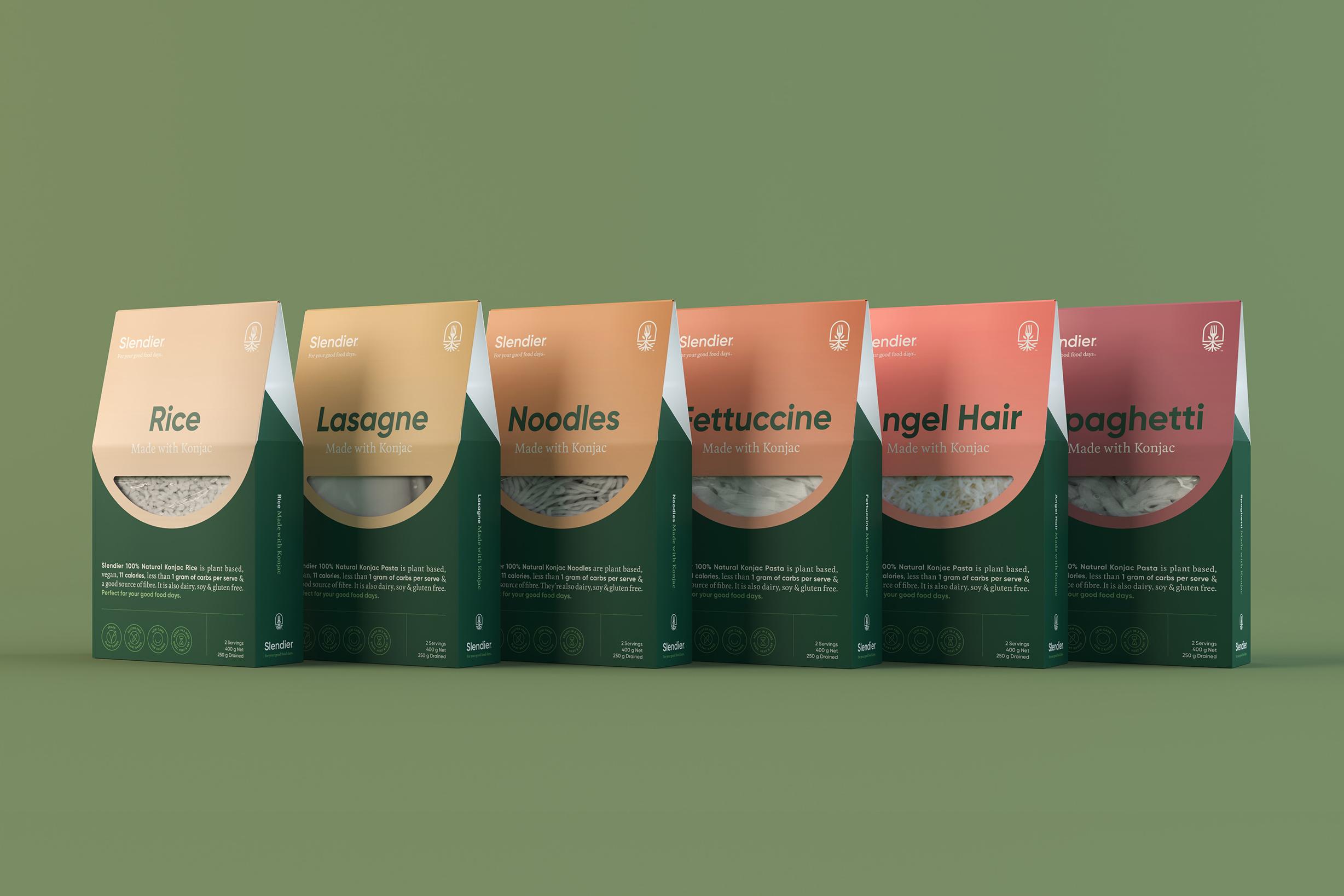
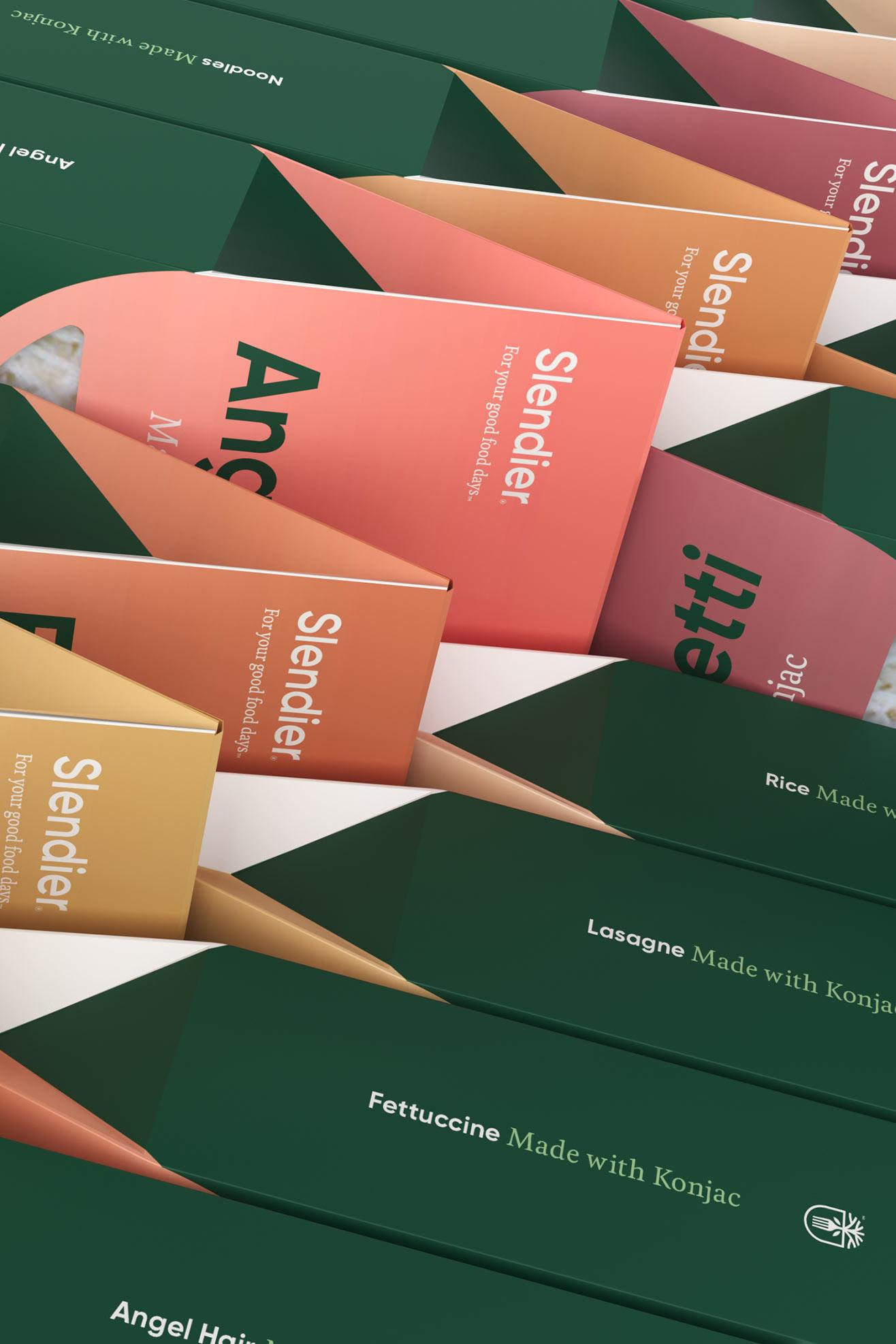
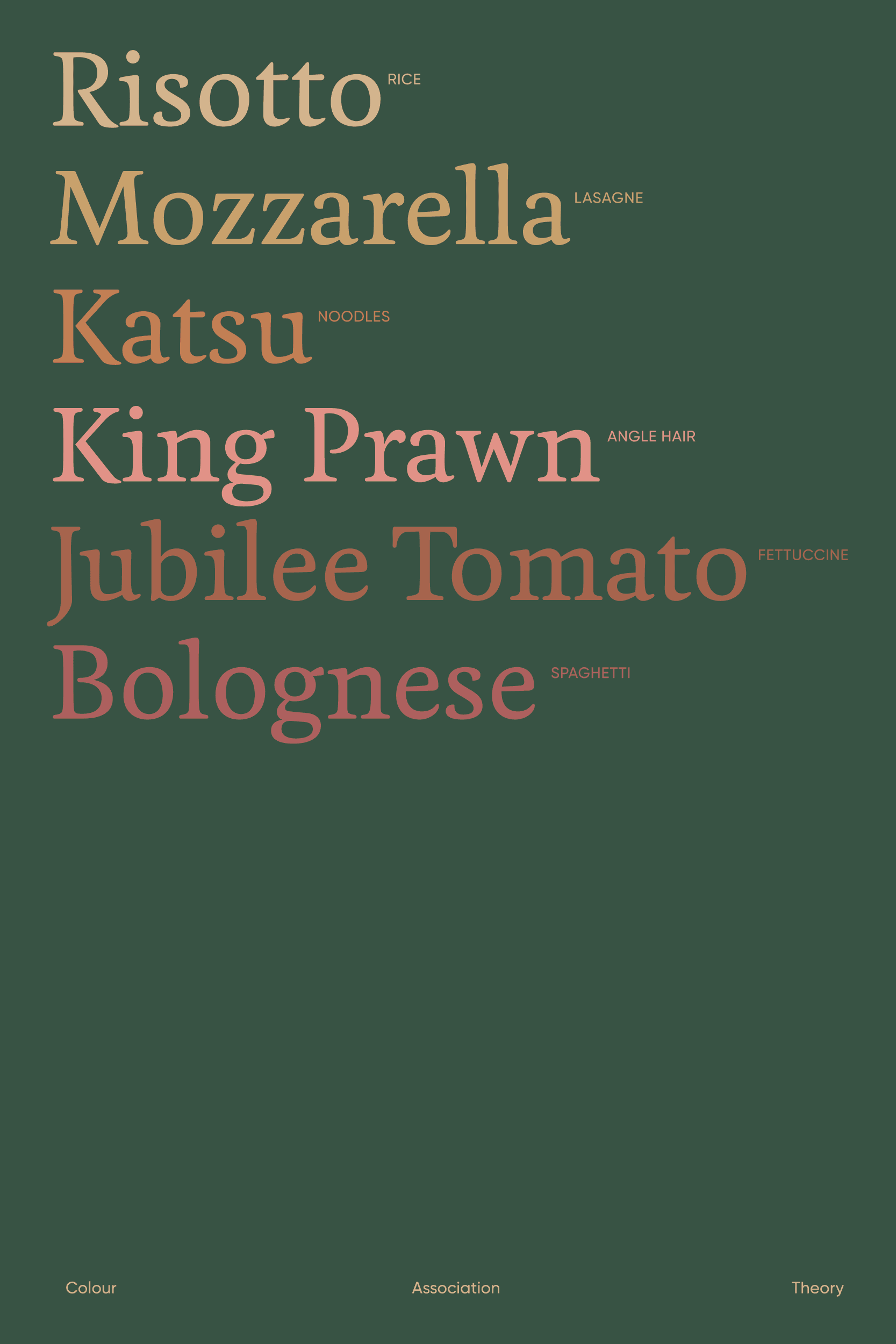
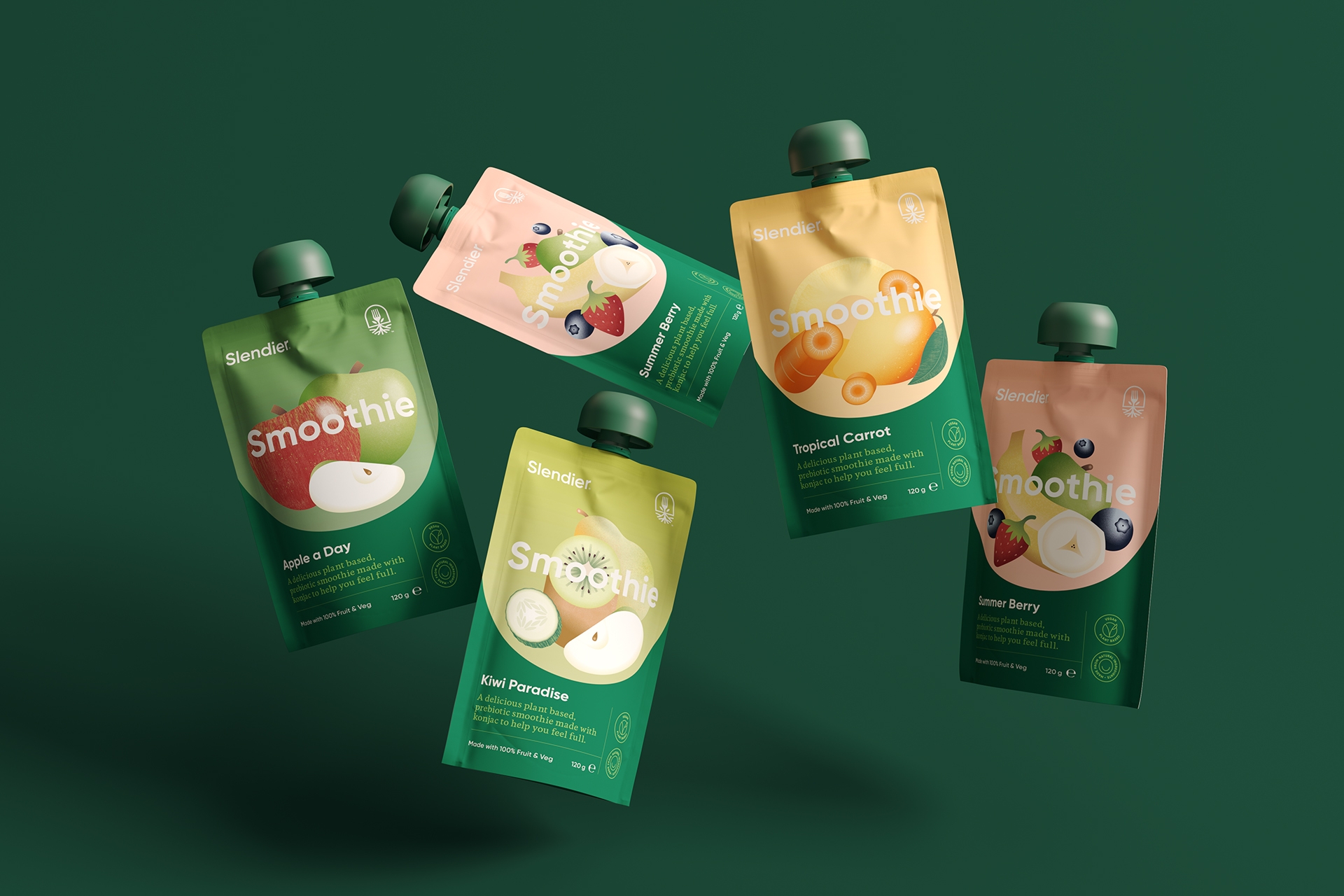
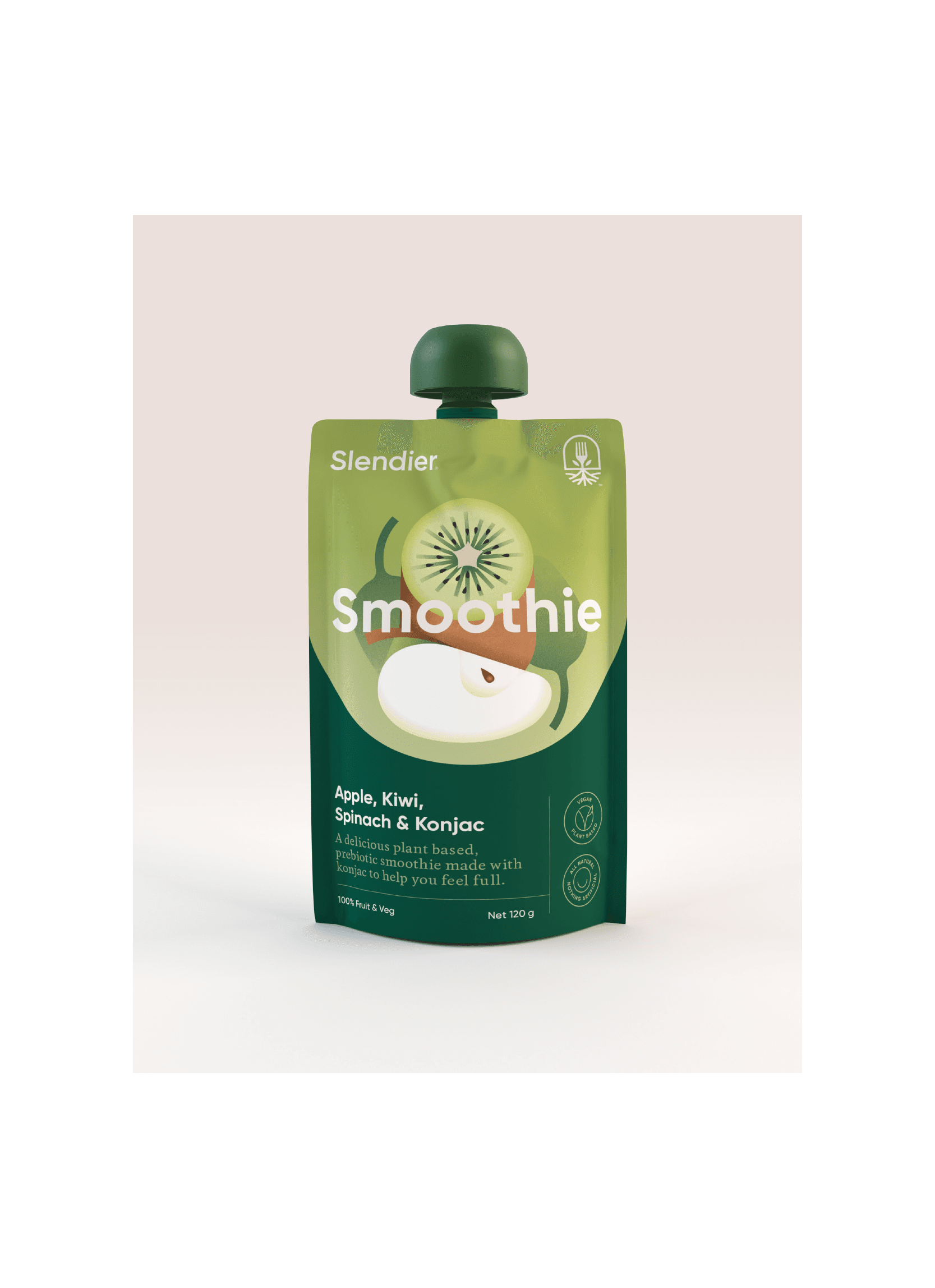
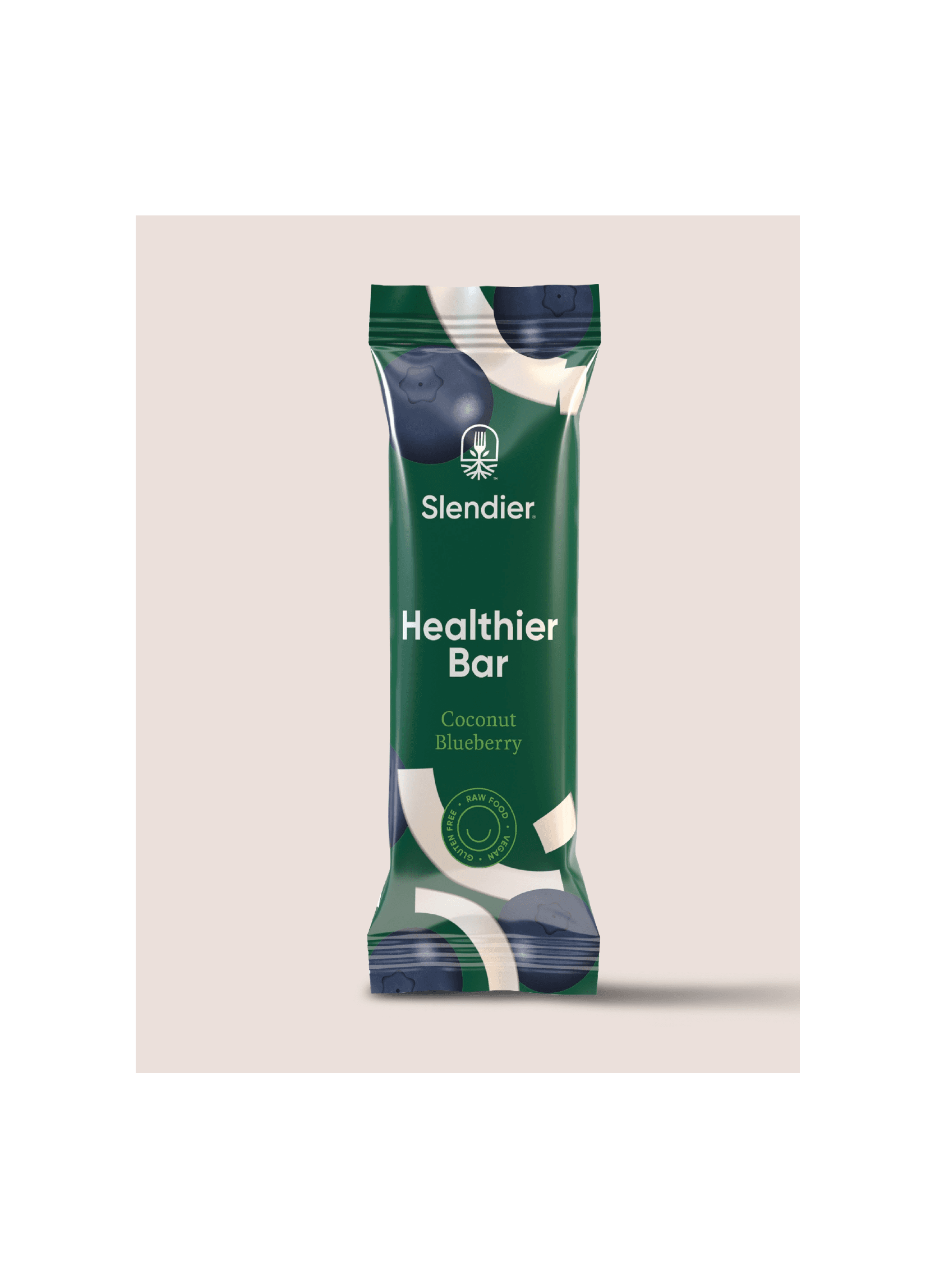
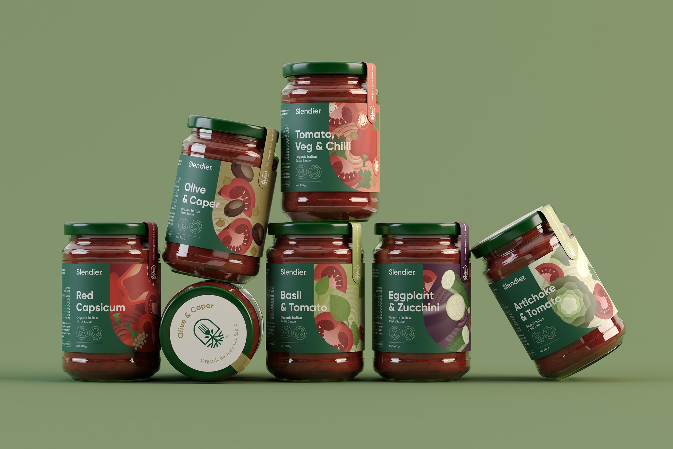
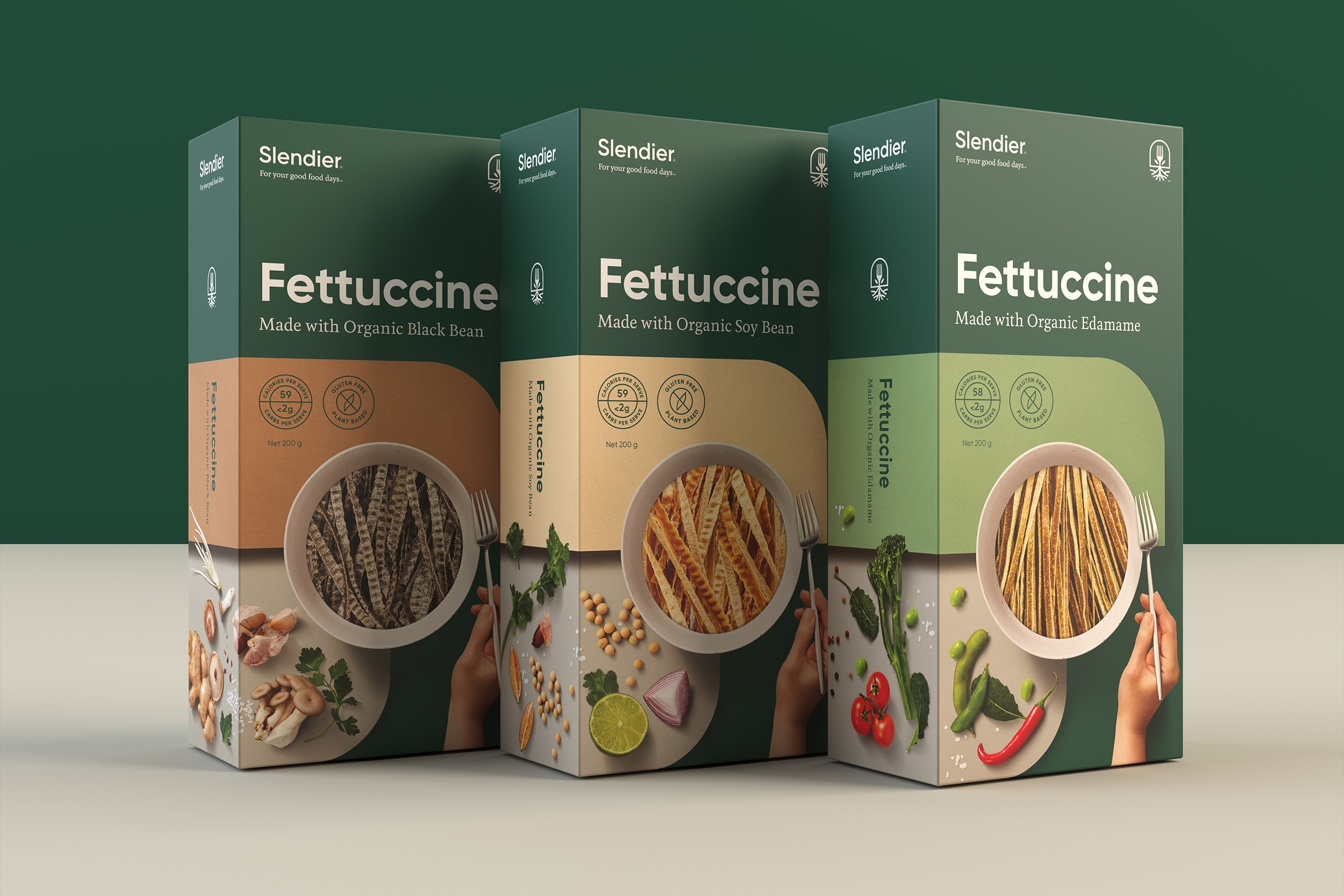
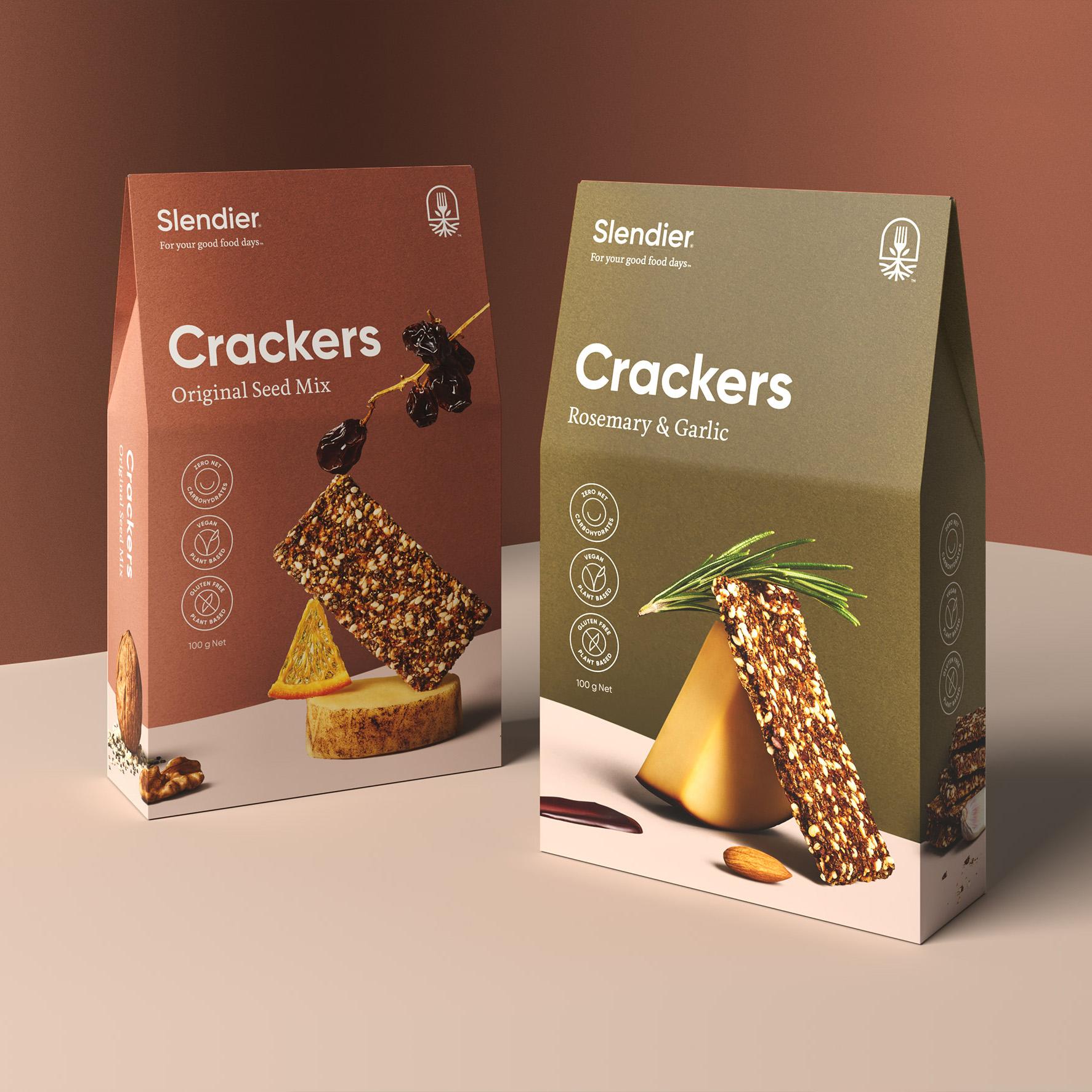
The packaging needed to cover a wide range of products from noodles, smoothies and pasta sauces to health bars and crackers. The first step in developing the packaging was to introduce a considered colour palette that aligned closely with the product itself. A happy ‘smile window’ enhanced the purity and fun of the brand while showcasing the raw products within.
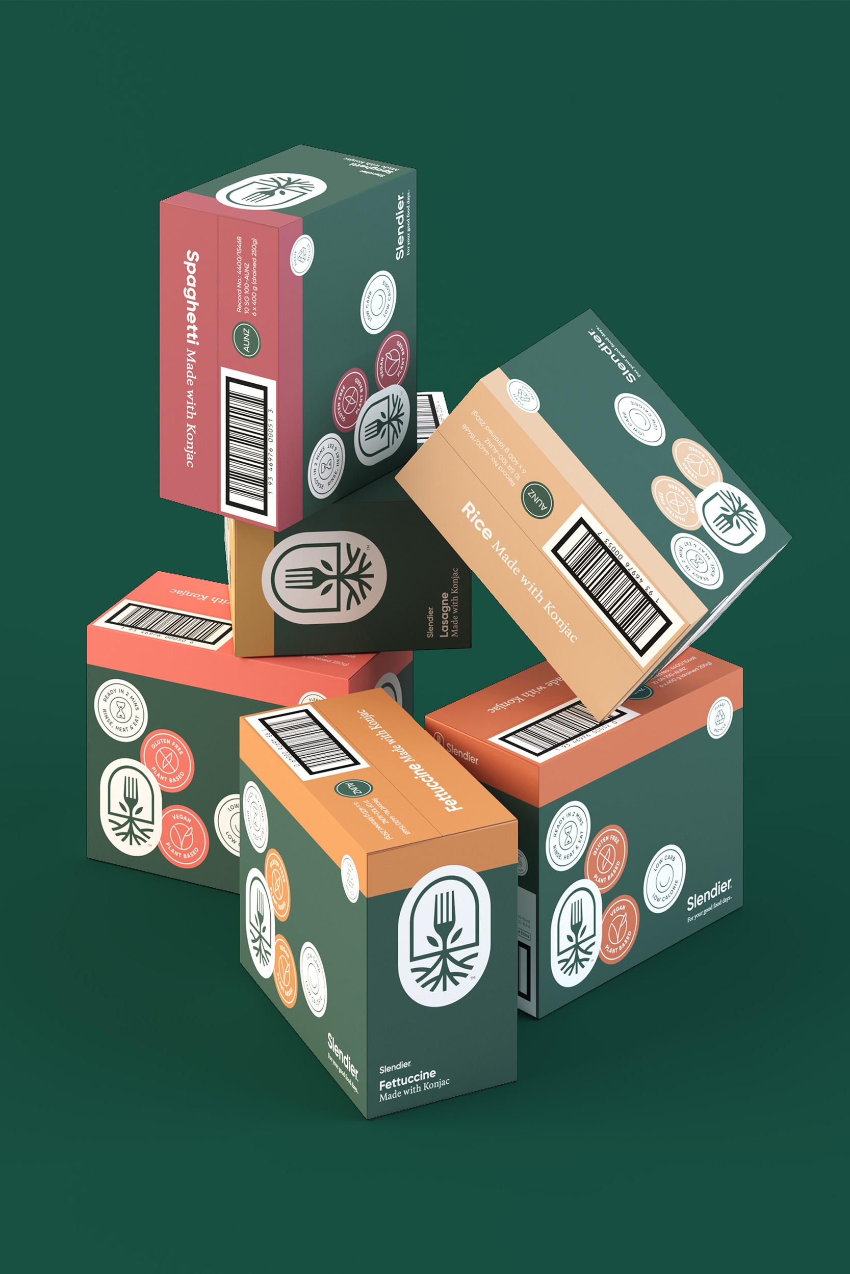
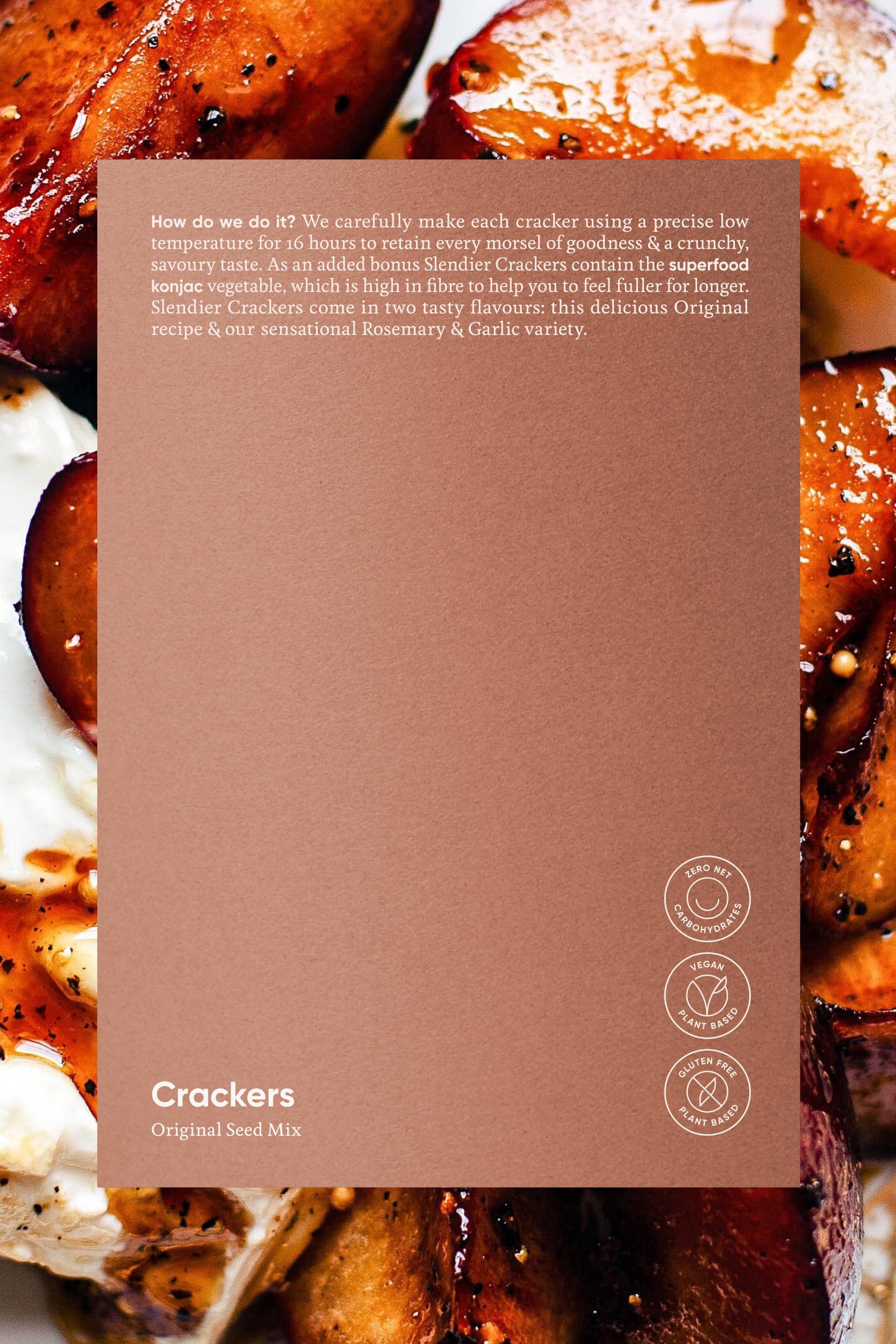
Honest. Considered. Kind. The boxes were designed to align with customer behaviours — easily showcasing key information and key dietary requirements identifiers.
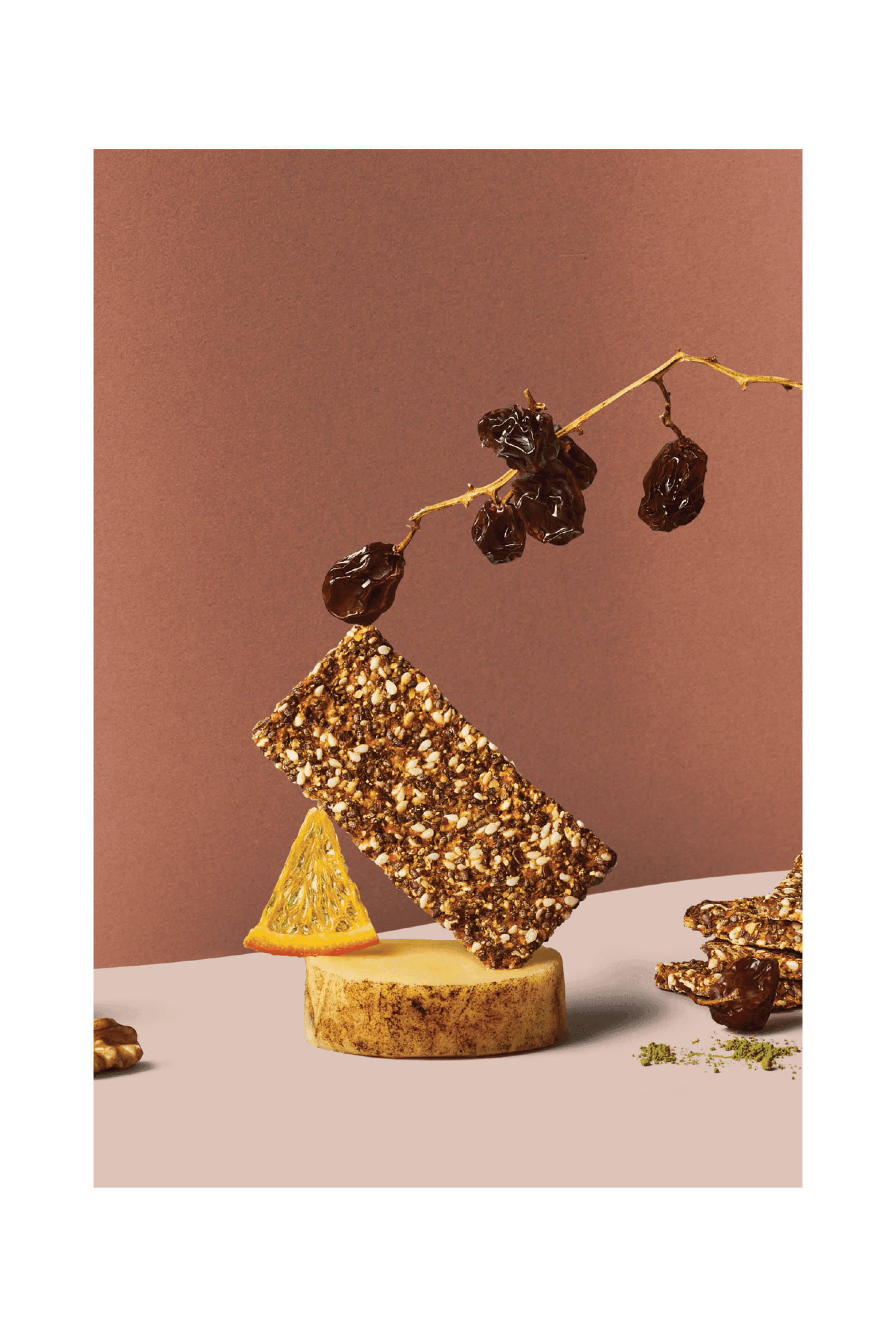
With Slendier products in all major supermarket chains, it was critical they felt unique and fresh. Illustrations by James Lake and Bonnie Eichelberger celebrate the brand’s ‘positive vibes’ as well as each product’s key ingredients.
